AI-powered marketing, lead response & automation for growth-focused teams. Jessica is online · answers in ~7s📞 (661) 219-7549

An identity inspired by broken pieces, renewed purpose and the Japanese idea of hope.
Nozomi called for an identity that could carry more than a name. The visual language needed to connect Japanese heritage, craftsmanship and renewal in a mark that felt organic, meaningful and distinctly human. The result is a fragmented circular identity built around the idea that something broken can become part of something new.
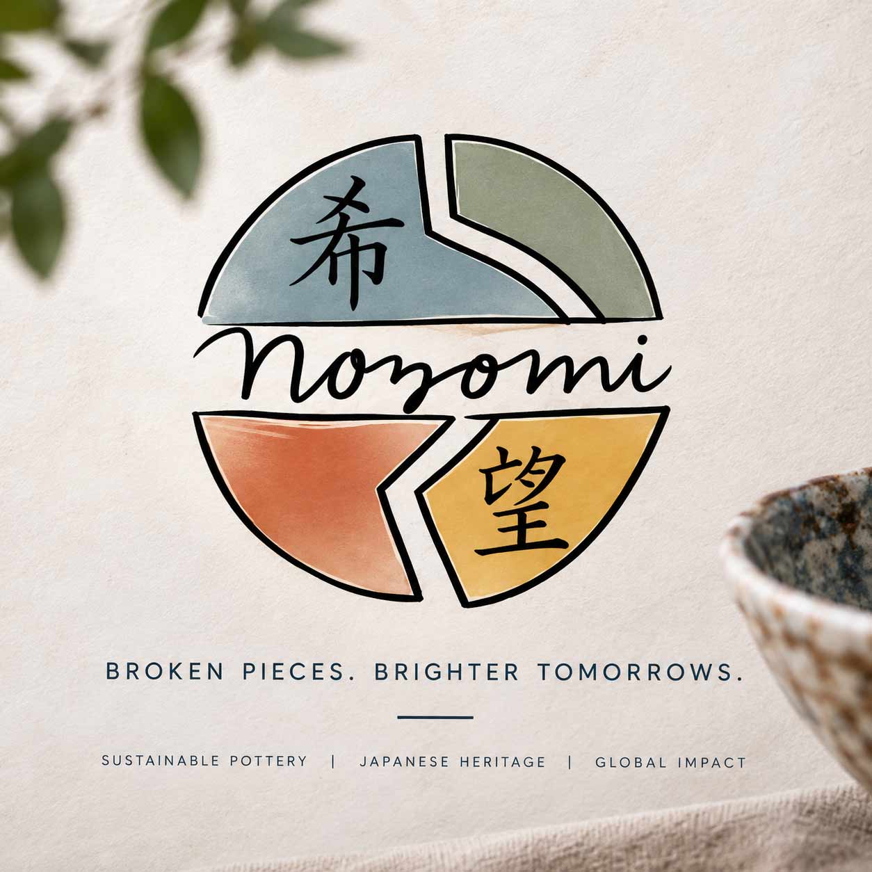
The Nozomi mark was designed around fragmentation and reconstruction. Rather than creating a perfectly enclosed symbol, the identity is assembled from individual forms — distinct pieces that become stronger when viewed together.
At its center, the handwritten Nozomi wordmark brings warmth and humanity to the structured geometry surrounding it. Japanese characters and an earthy four-color palette connect the identity to its cultural inspiration while giving each segment its own visual character.
The imperfection isn’t hidden. It’s the point.
Muted blue, sage green, terracotta and warm ochre give Nozomi a palette that feels handcrafted rather than manufactured. Paired with natural neutrals, tactile materials and generous whitespace, the system creates a balance between Japanese restraint and artisan warmth.
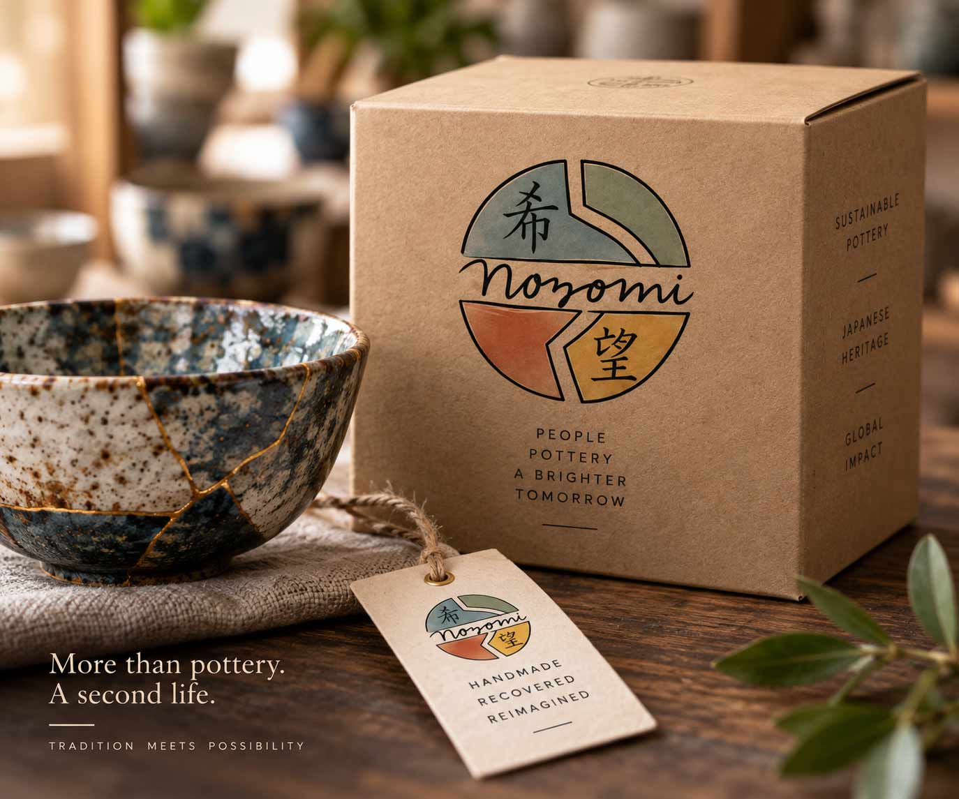
The identity was extended into a packaging system that treats the product and its story as one experience. Uncoated kraft materials, understated typography and small storytelling details reinforce the ideas of craft, recovery and responsible creation.
Rather than competing with the pottery, the packaging provides a quiet framework around it — allowing texture, material and the Nozomi mark to carry the brand.
Handmade. Recovered. Reimagined.
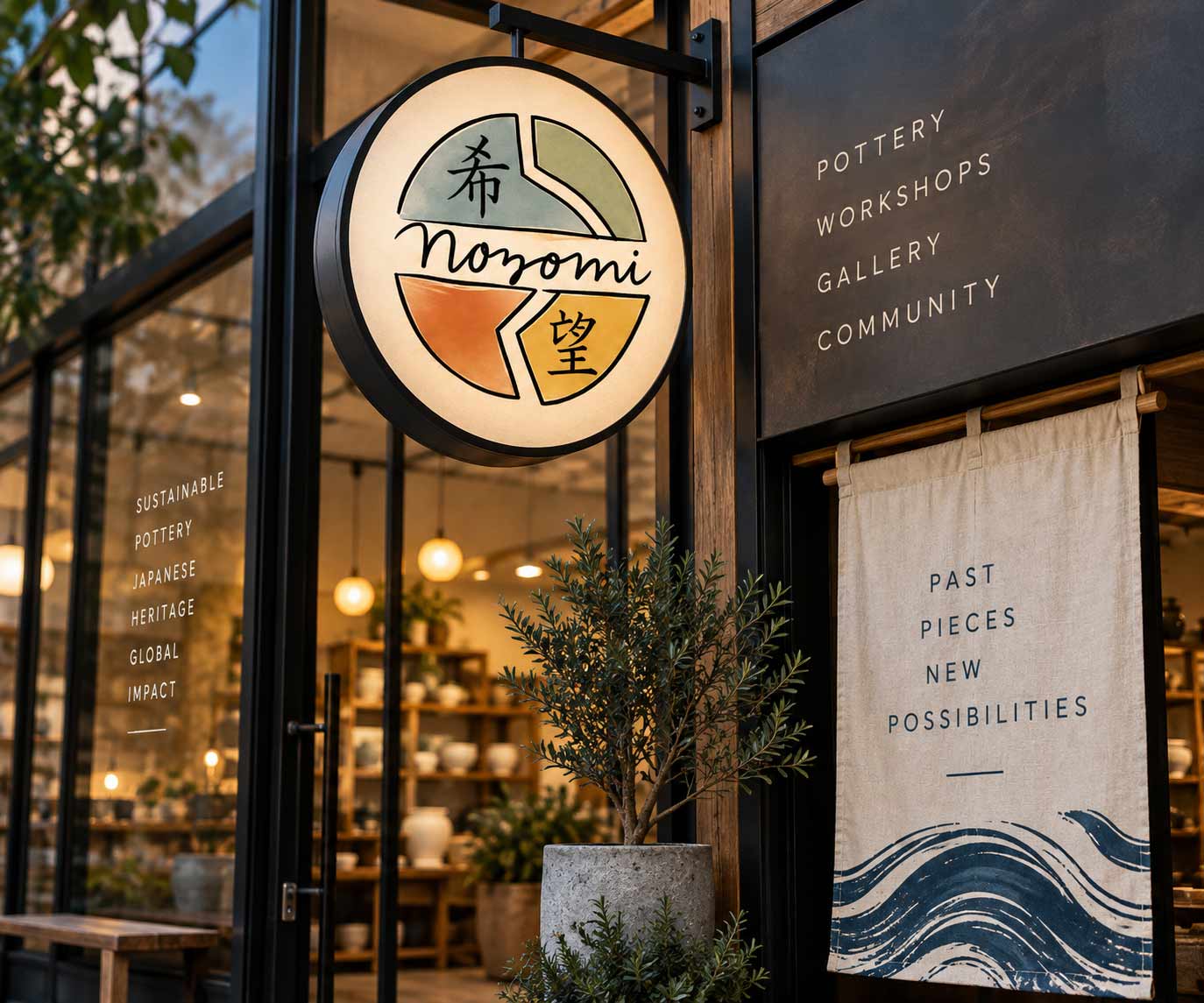
A useful identity has to work at every scale. The circular Nozomi mark becomes a natural piece of environmental signage, while the broader visual system extends into window graphics, banners, wayfinding and in-store storytelling.
The result is an environment that feels recognizably Nozomi without requiring the logo to appear on every surface.
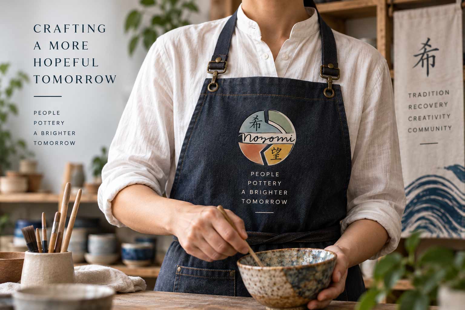
The brand becomes more personal when it moves from packaging and signage to the people creating the product. Applied to natural fabrics and workwear, the Nozomi mark feels less like a corporate badge and more like a maker’s mark — a signature connecting the artisan, the object and the story behind it.
People. Pottery. A brighter tomorrow.
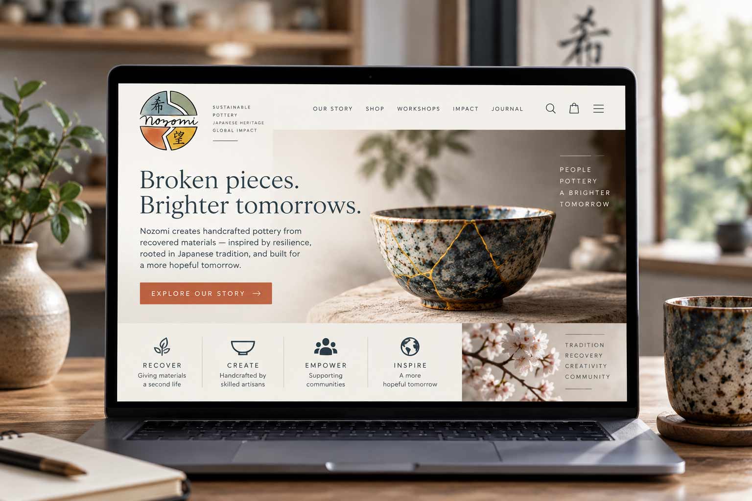
Digitally, the system becomes quieter and more editorial. Generous whitespace, natural photography and restrained typography create room for the products and their stories to lead.
The identity provides the connective tissue — carrying the same visual cues from packaging and physical environments into a digital experience built around discovery, craft and purpose.
The strongest brands don’t rely on constant repetition of a logo. They create a recognizable world. Across product, packaging, environment and digital applications, Nozomi’s visual language remains consistent through color, typography, materials, imagery and message — each application can stand on its own while still feeling unmistakably connected to the same story.
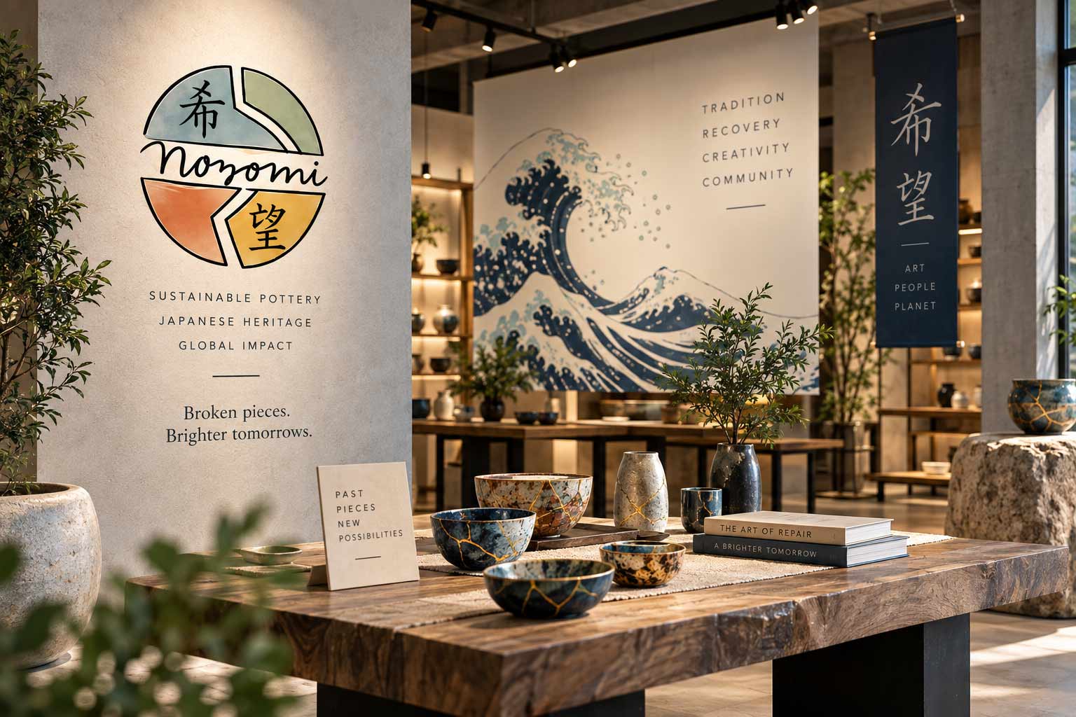
The Nozomi logo began as an original identity design from earlier graphic design work. For this case study, the original mark was revisited to explore how its visual language could expand across packaging, environmental, apparel and digital applications. The original logo remains at the center of the work — the surrounding applications demonstrate how a strong identity concept can grow into a cohesive brand system.
From identity and messaging to digital, print and physical applications, AgencyFix builds brands designed to work wherever customers encounter them.
She isn't a chatbot in the corner. Jessica is the same AI we build for clients — she can answer questions about this project or how a branding engagement works.