AI-powered marketing, lead response & automation for growth-focused teams. Jessica is online · answers in ~7s📞 (661) 219-7549

Building a brand around hope, continuity and the possibility of change.
Recovery Forever needed an identity capable of communicating something difficult: the seriousness of recovery without allowing the brand itself to feel defined by struggle. The visual system was built around a simple idea—recovery isn’t a single moment. It’s an ongoing journey.
From the identity and stationery system to brochures, advertising, digital experiences, signage and trade-show materials, the brand was designed to remain recognizable and reassuring wherever someone encountered it.
The Recovery Forever identity begins with the idea of continuity. An interlocking symbol creates a visual connection to infinity—a path without an arbitrary endpoint—while the transition from black to red introduces movement, optimism and forward momentum.
The wordmark carries that same transition into the name itself, allowing Recovery and Forever to remain distinct while functioning as one idea. The goal wasn’t to make recovery appear easy. It was to create an identity that could acknowledge the journey while keeping its focus firmly on what comes next.
Progress continues. So does the possibility of change.
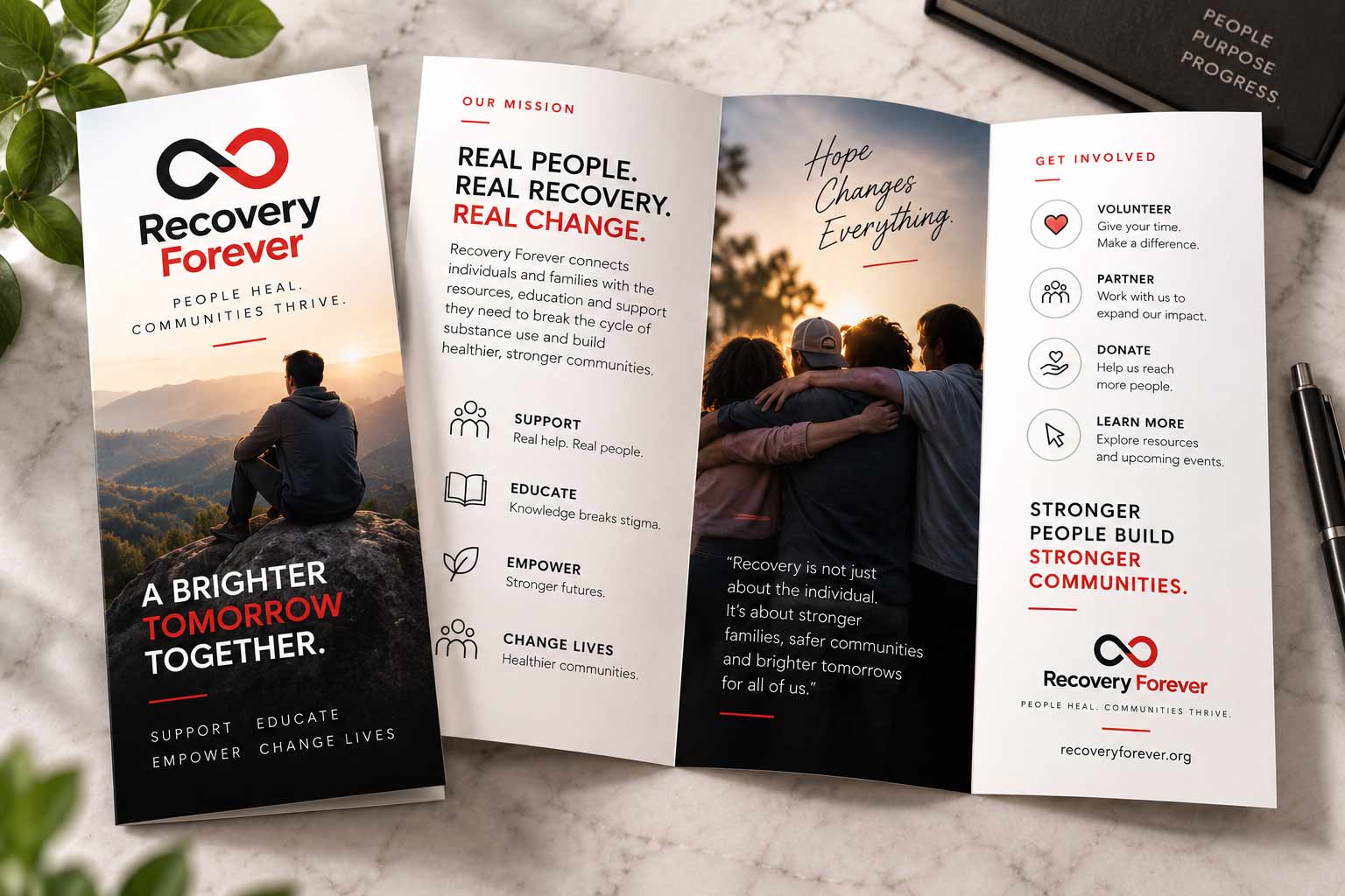
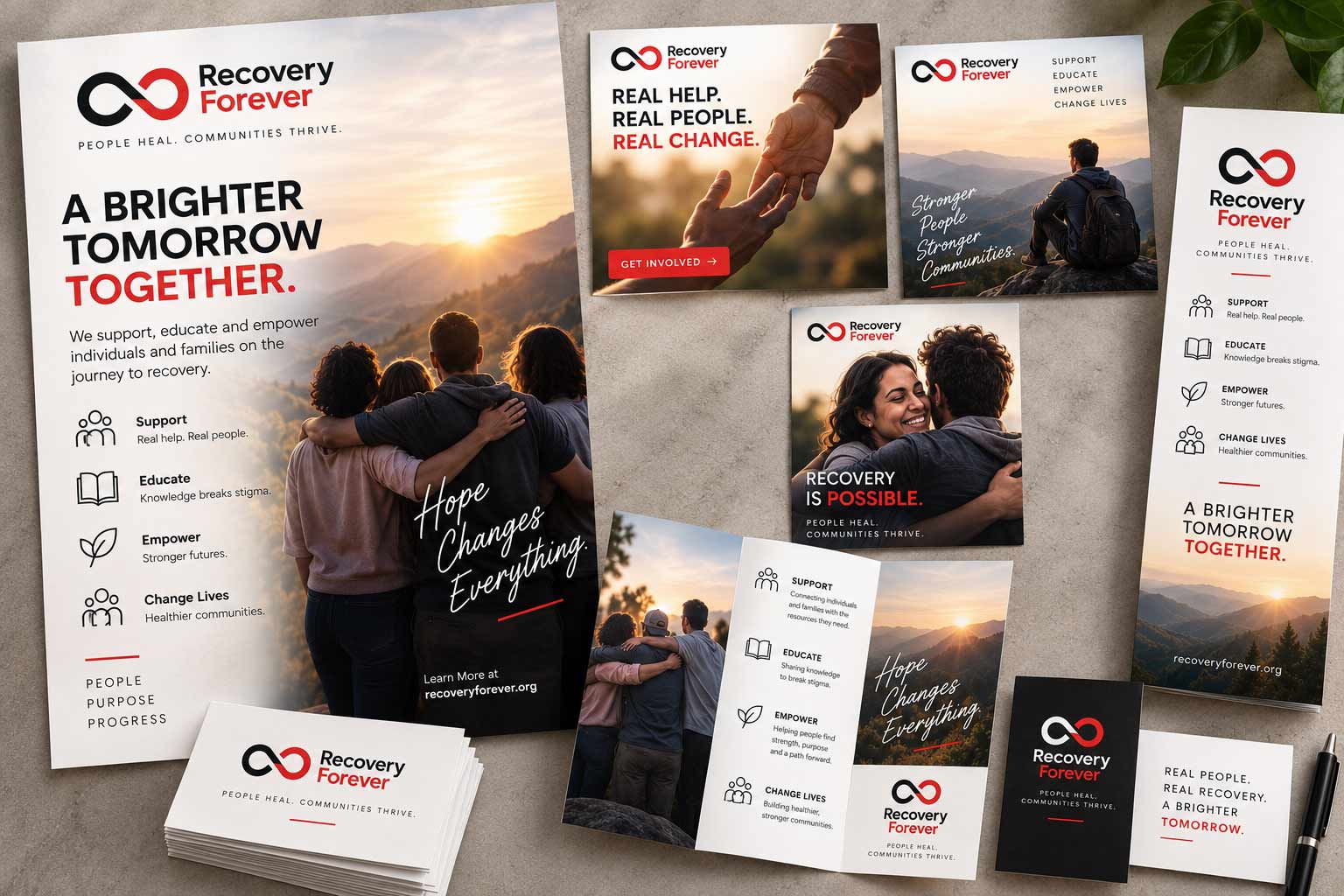
For an organization working in recovery, printed materials have a job beyond promotion. They need to make information approachable, organized and easy to understand. The identity was extended across brochures, flyers and informational materials using consistent typography, imagery, messaging and visual hierarchy.
The system gave Recovery Forever enough structure to communicate serious information clearly while maintaining a tone that felt supportive rather than institutional.
A brand becomes credible through repetition. Business cards, letterhead, folders and everyday communication materials gave Recovery Forever a consistent presence beyond its major marketing campaigns. Rather than treating each item as a separate design exercise, the collateral was built from the same underlying system: restrained typography, deliberate use of red, generous whitespace and a highly recognizable mark.
ONE ORGANIZATION.
ONE VOICE.
ONE VISUAL SYSTEM.
Collateral shown uses fictionalized contact information for case-study privacy.
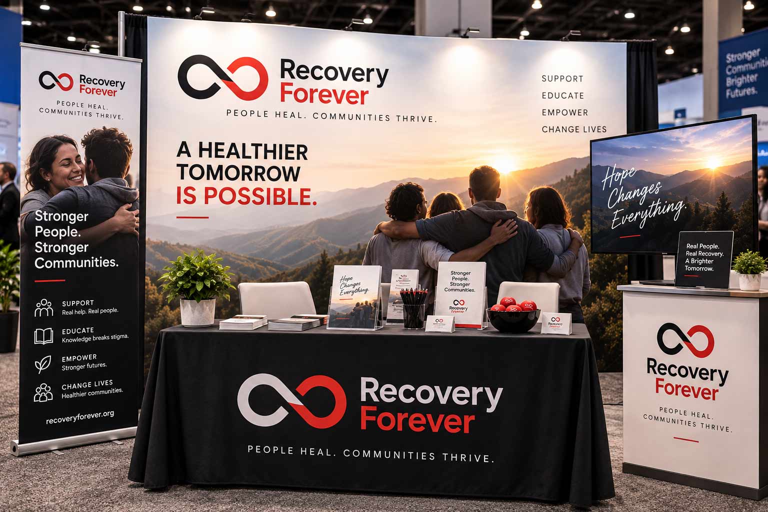
The identity also needed to work at an entirely different scale. Trade-show graphics and event materials translated the Recovery Forever system into an environment that could attract attention from across a crowded room while remaining approachable once someone stepped inside.
Large-format messaging, photography and the red-and-black identity created visibility at a distance. Supporting collateral carried the same experience into one-on-one conversations.
A strong identity should still feel like itself at 3 inches or 30 feet.
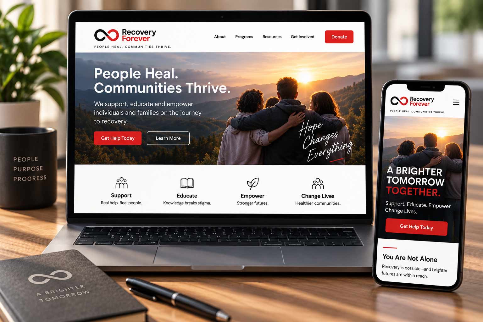
Digital channels introduced a different challenge. Someone encountering Recovery Forever online could be researching for themselves, helping someone they care about, or simply trying to understand what resources were available. The digital system therefore prioritized clarity, human imagery and straightforward pathways to information.
Website design and digital advertising carried the established identity into a medium where communication needed to be immediate—maintaining visual consistency while giving content and calls to action room to breathe.
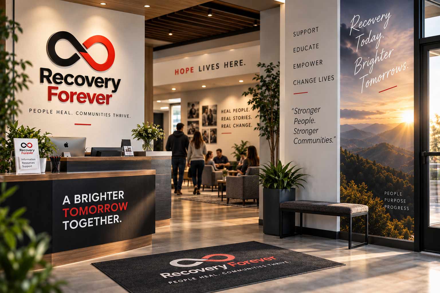
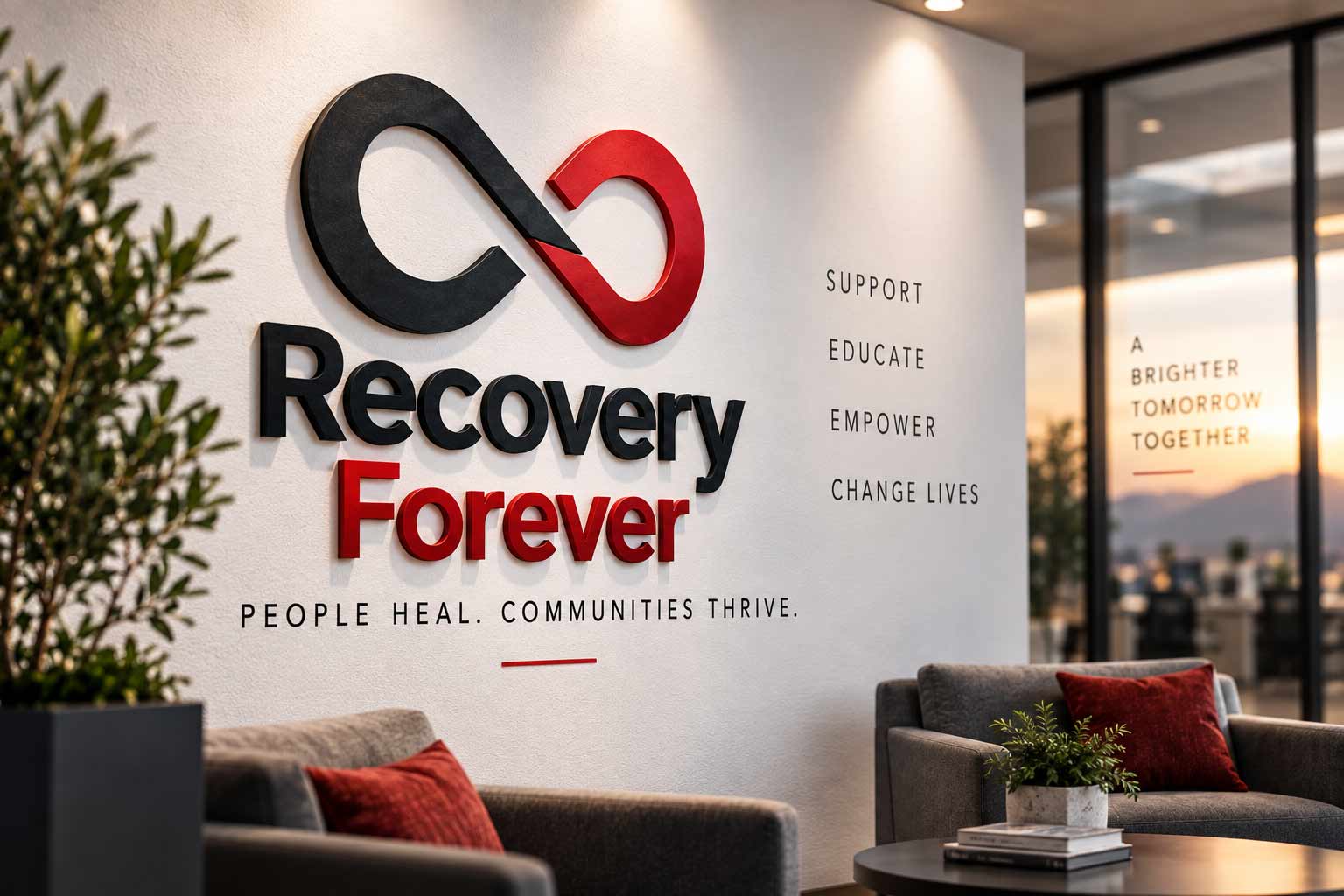
The final test of a visual system is whether it can move beyond marketing materials and become part of an environment. Signage, wayfinding, wall graphics and branded spaces allow the same identity to shape an in-person experience—creating continuity between something first encountered in an ad or brochure and the organization someone eventually walks into.
The logo doesn’t need to dominate every surface. Color, typography, photography and message can do just as much of the work.
HOPE LIVES HERE.
This environmental view is a contemporary case-study visualization of how the Recovery Forever identity can extend into a physical space, not a depiction of an actual facility.
The Recovery Forever engagement extended across a broad range of brand and marketing applications, including identity development, stationery, brochures, flyers, advertising, website design, signage and trade-show materials. That breadth required more than a collection of individual designs—each piece needed enough flexibility to solve its own communication problem while still belonging unmistakably to Recovery Forever.
For this case study, the work has been re-presented through contemporary mockups and expanded visualizations that demonstrate the breadth and scalability of the original identity system.
From something held in the hand to something seen across a trade-show floor, the same visual language can create recognition, continuity and trust. That is the role of a brand system: not simply to look consistent, but to make every interaction feel like it came from the same organization.
AgencyFix creates identity systems designed for the real world—from logos and visual language to websites, collateral, campaigns and physical environments.
She isn't a chatbot in the corner. Jessica is the same AI we build for clients — she can answer questions about this project or how a branding engagement works.