AI-powered marketing, lead response & automation for growth-focused teams. Jessica is online · answers in ~7s📞 (661) 219-7549

An identity built for a comeback.
For professional golfer Anton Haig, the next chapter called for an identity that represented more than the game. It needed to represent return, resilience and the decision to rise again.
The resulting identity draws on the symbolism of the phoenix—a mark built around movement, renewal and the possibility of beginning again.
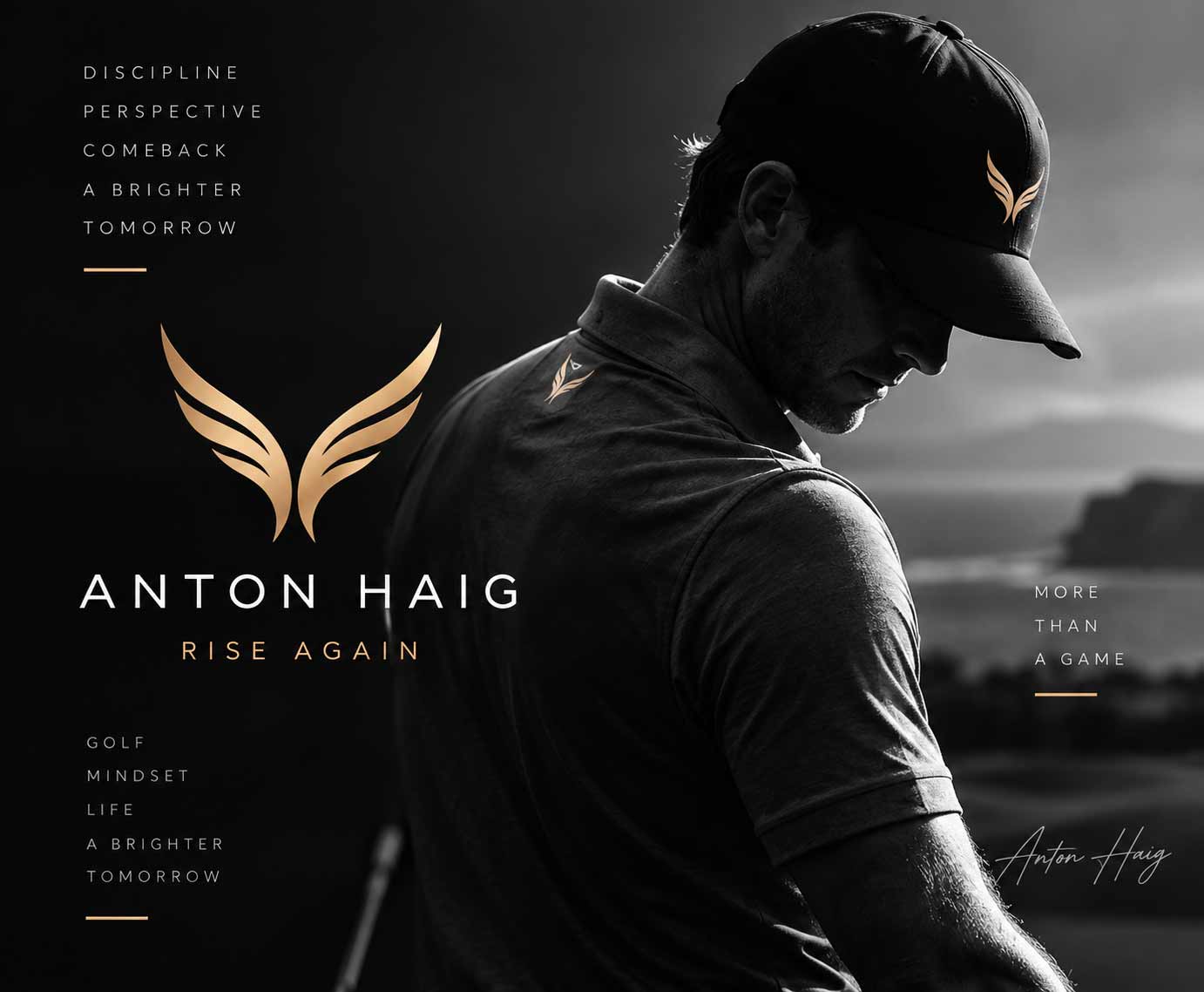
Anton Haig had already competed as a professional golfer. This identity was created around the story of what came next: a return to the game and the beginning of another chapter. That made the phoenix a natural visual territory.
Rather than illustrating the bird literally, the identity reduces the idea to its most recognizable gesture—two upward forms that can be read as wings, movement and ascent. The result is a mark that doesn’t simply say golf. It says something about the person behind it.
Personal brands have a unique challenge: the identity has to represent an individual without becoming dependent on a portrait, signature or literal depiction of what they do. The Anton Haig mark was designed to stand on its own.
Symmetrical upward forms create the impression of wings while leaving enough abstraction for the symbol to function as an athletic mark across apparel, equipment, digital media and personal communications. Paired with widely spaced typography, the identity takes on a quieter, more premium character—allowing the symbol to carry much of the personality.
The mark isn’t about where you’ve been. It’s about where you’re going.
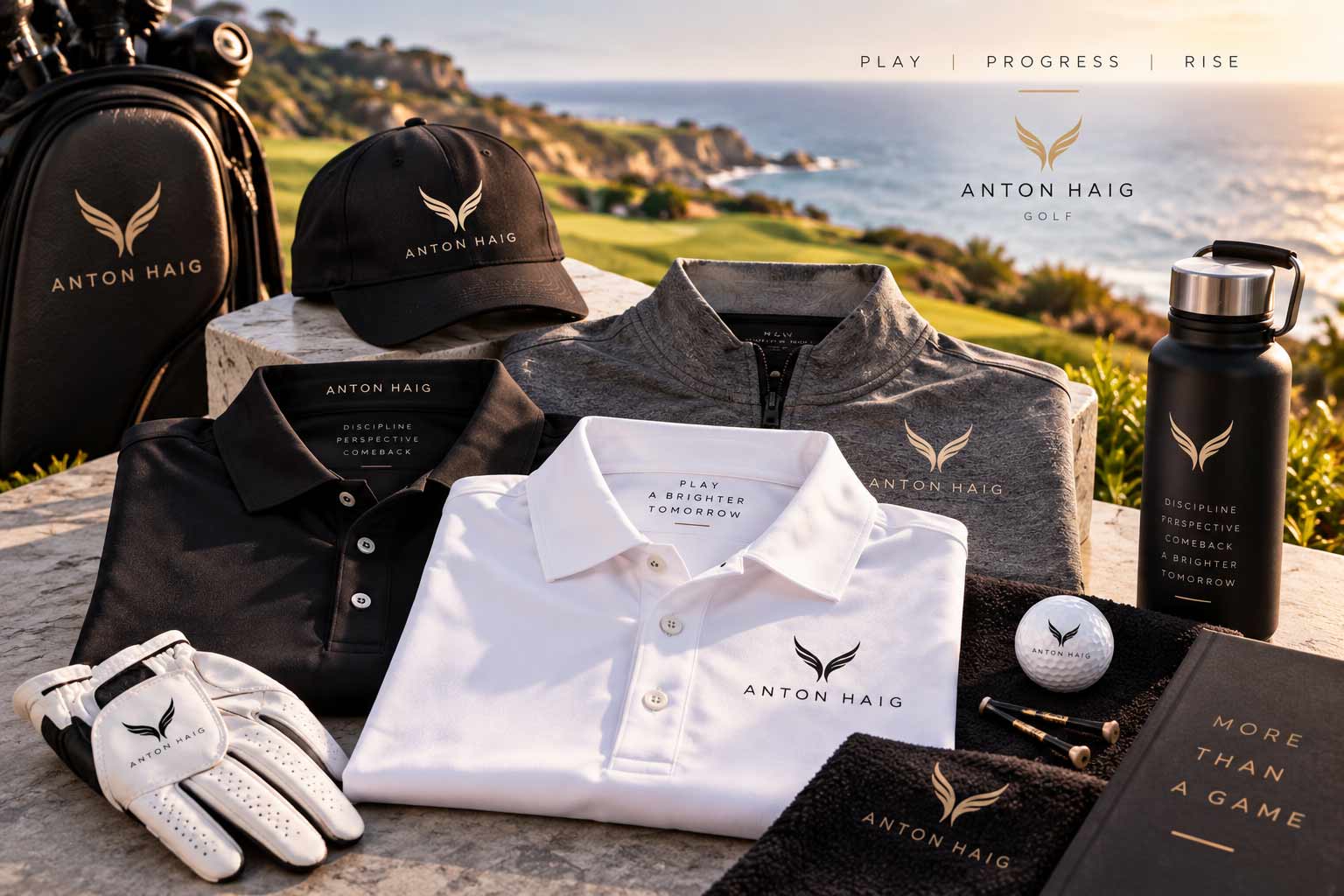
For an athlete, the identity inevitably leaves the page. It has to work embroidered at a small scale, viewed from across a course and reproduced across garments with very different materials and colors. The simplicity of the phoenix mark gives the identity that flexibility.
On caps, polos, outerwear and accessories, the symbol can operate independently while remaining connected to the larger Anton Haig identity. The restrained black, white and gold palette reinforces the sense that this is a personal brand—not simply another piece of golf merchandise.
Symbol / Wordmark / Monogram-like Recognition
Strong identities don’t need large surfaces. A golf ball. A glove. A towel. A headcover. Each becomes an opportunity for recognition without requiring the full identity to be repeated everywhere.
The phoenix symbol was designed with that reality in mind: simple enough to reproduce at small scale, distinctive enough to be recognized without the name beside it.
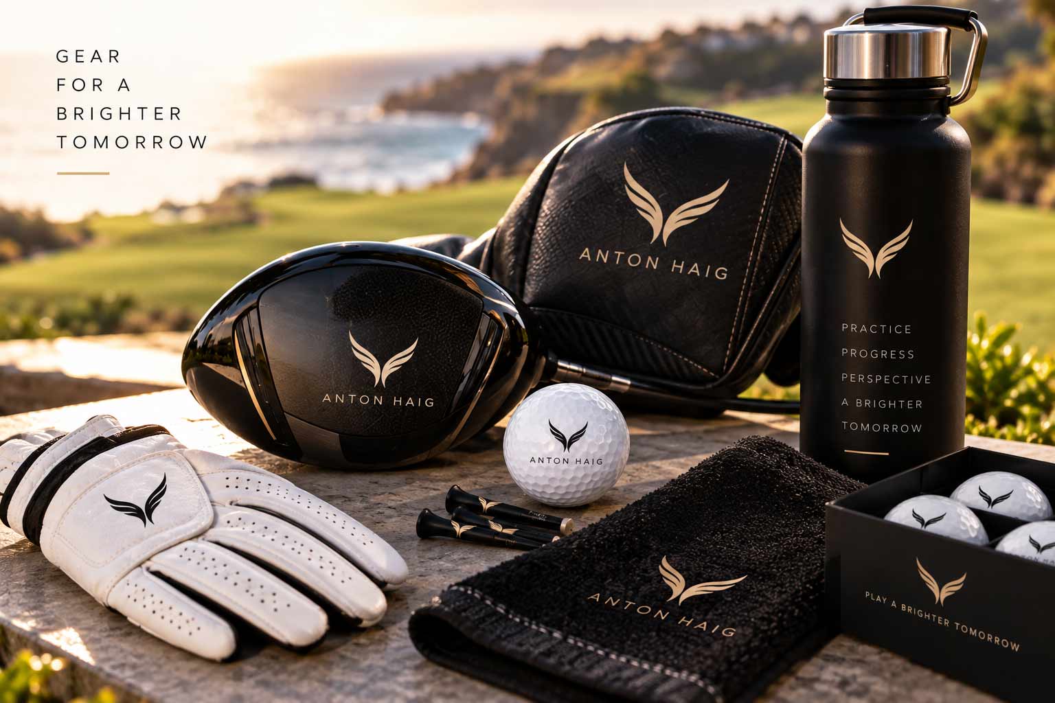
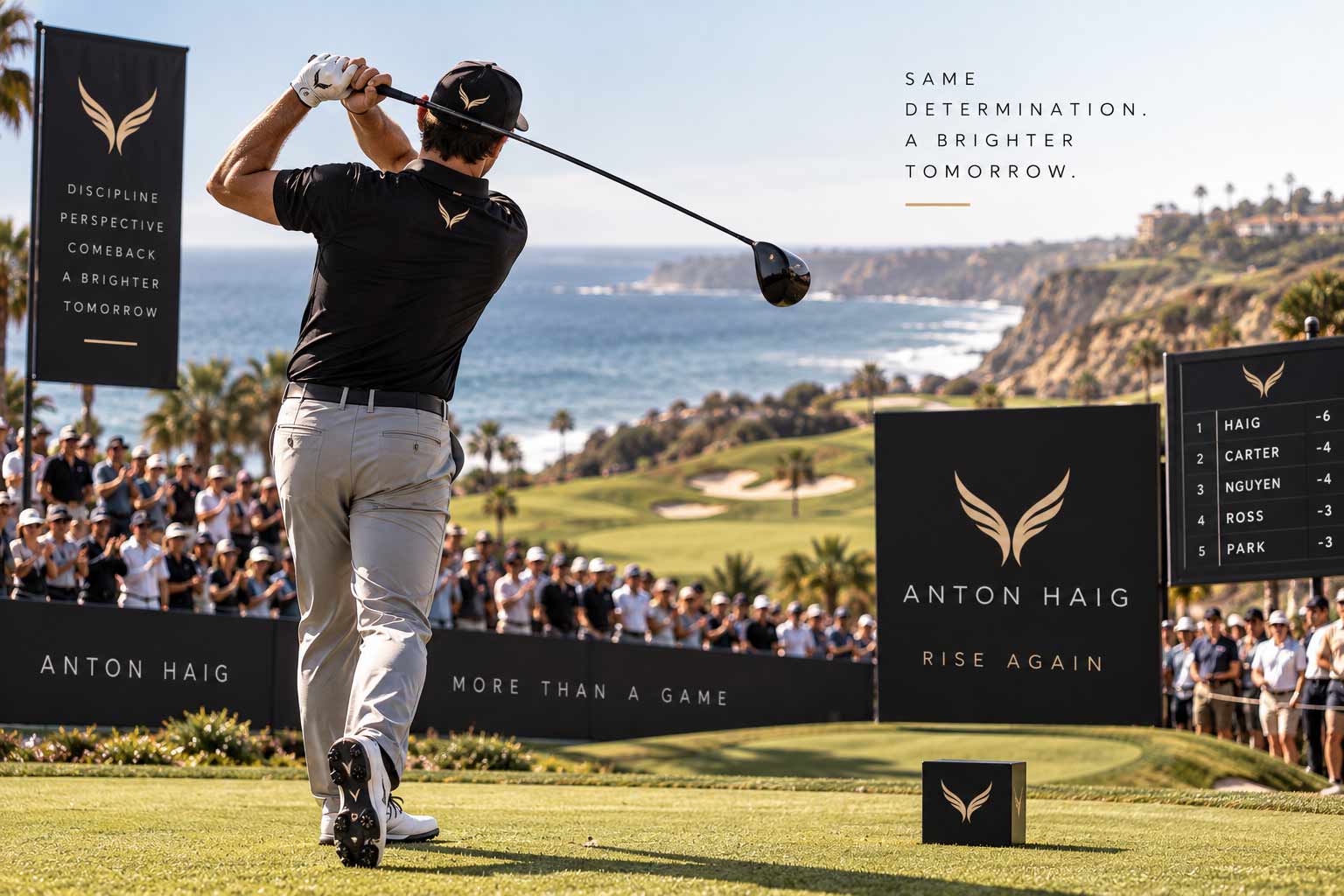
Personal branding in professional sports exists in an unusual environment. The athlete is the brand’s most visible expression. The identity therefore has to complement the person rather than compete with them—appearing naturally on apparel, equipment, signage and event applications without overwhelming the sport itself.
The athlete comes first. The identity gives the story a recognizable form.
An athlete’s story extends beyond competition. Training, setbacks, perspective, progress and life away from the course all contribute to how people understand the person behind the performance.
A digital expression of the Anton Haig identity can give those stories a consistent home—using photography, typography and the phoenix mark to connect the competitive side of the brand with the more personal one.
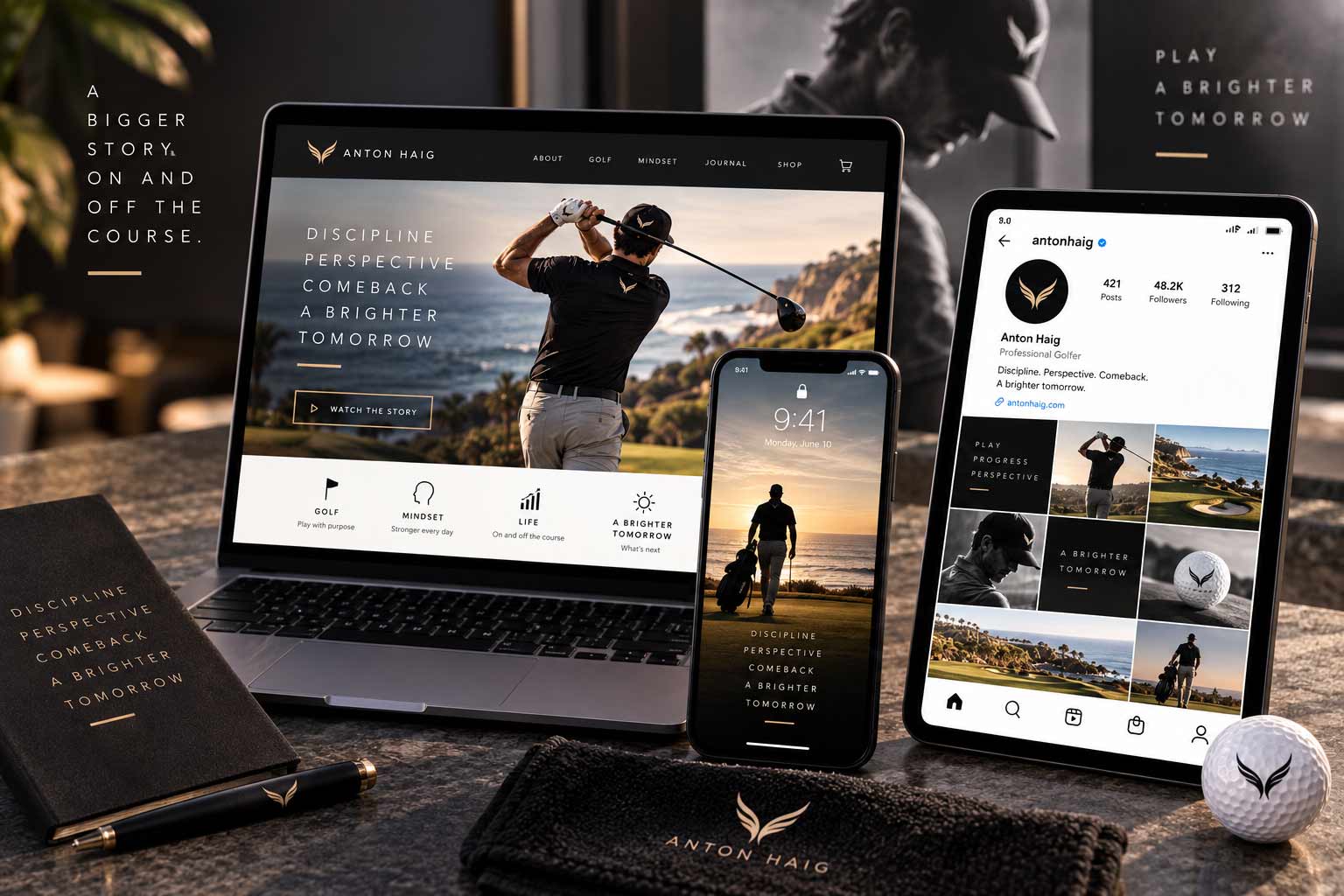
More than a game.
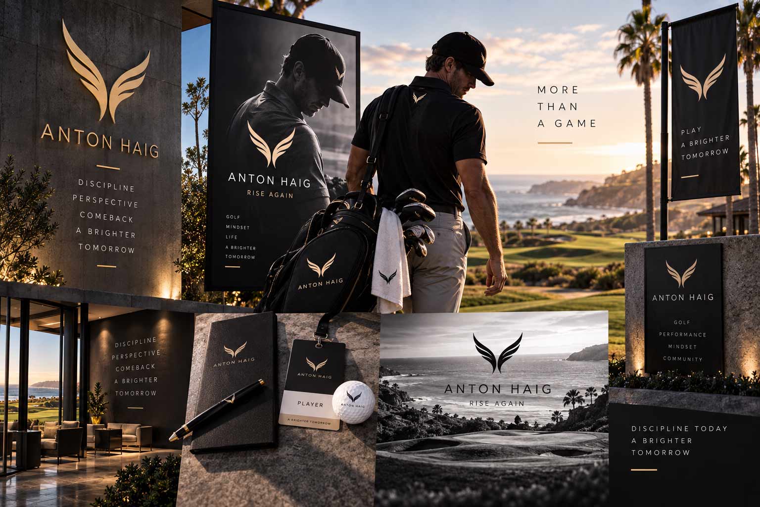
The strongest personal brands create a world around a person without turning that person into a product. Across apparel, equipment, digital storytelling, event presence and communications, the Anton Haig identity provides a consistent visual thread. The applications can change. The underlying idea doesn’t.
The original Anton Haig project centered on the development of a personal identity for a professional golfer preparing for a return to the game. The phoenix-inspired mark and supporting logo configurations were created around that story of renewal and comeback.
For this case study, the original identity has been re-presented and expanded across contemporary applications to demonstrate how the system can live across apparel, equipment, digital storytelling and the broader athlete experience. The original idea remains at the center: sometimes a brand isn’t about becoming someone new. It’s about representing who you’re becoming next.
Anton Haig demonstrates how identity can begin with something more meaningful than an industry, product or category. It can begin with a story. When the underlying idea is strong enough, a single mark can carry that story across everything that follows.
Discipline. Perspective. Progress.
A Brighter Tomorrow.
AgencyFix creates brand identities built around ideas—visual systems designed to communicate who you are, what you stand for and where you’re going next.
She isn't a chatbot in the corner. Jessica is the same AI we build for clients — she can answer questions about this project or how a branding engagement works.