AI-powered marketing, lead response & automation for growth-focused teams. Jessica is online · answers in ~7s📞 (661) 219-7549

Making care feel more like home.
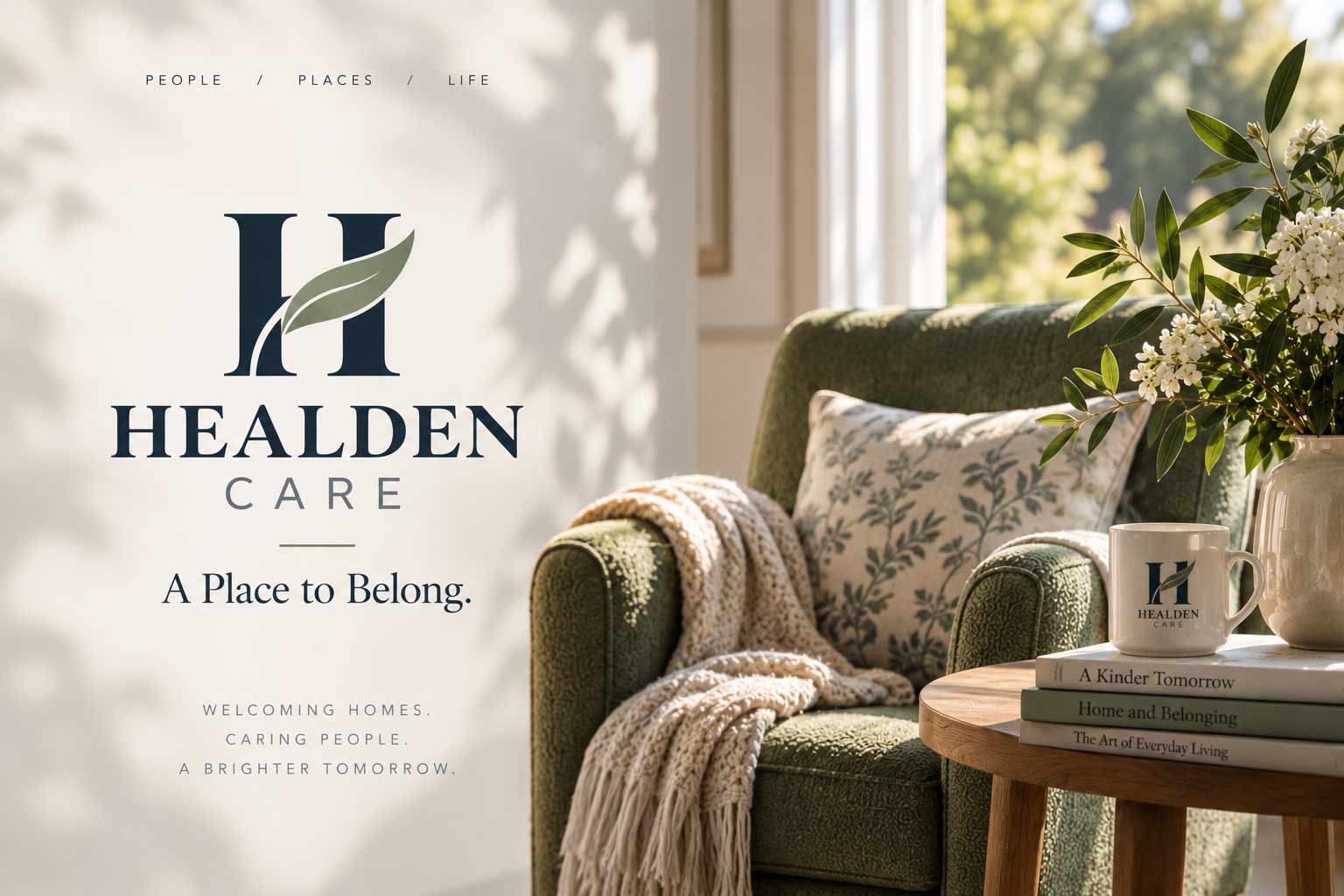
Healden Care needed an identity capable of balancing two very different expectations. It had to communicate the trust and professionalism expected of a care organization while still feeling warm, residential and human to the people who would call it home—and to the families helping them make that decision.
The final identity brings those qualities together through a refined H-and-leaf mark, a natural color system and a visual language built around people, place and everyday life.
Healden Care already had substantial brand thinking behind it. An outside agency had developed a structured set of guidelines covering positioning, messaging, accessibility, applications and brand protection. But the central visual asset—the logo itself—wasn’t performing as strongly as the thinking around it.
The original leaf treatment became difficult to read in smaller, reversed and single-color applications. The visual hierarchy was also carrying too much information inside the primary lockup.
A separate concept explored by the company’s owner offered a more promising direction: an H with a natural leaf form threading through the letter.
The opportunity was not to discard everything and start again. It was to identify what was working, fix what wasn’t, and turn the strongest idea into a more resolved identity system.
Keep the thinking. Strengthen the identity.
The strongest concept combined two simple forms: the H of Healden and a leaf representing the life within the home.
The refinement focused on making that idea work beyond a presentation board. The leaf became a recognizable organic form rather than a decorative shape. Negative space separates it from the letterform so the two elements remain readable when reproduced in one color. The overall construction was simplified so the monogram could function independently at smaller sizes.
The result is a mark designed not only to look right at presentation scale, but to survive the places a care brand actually needs to appear—from signage and printed materials to uniforms and small-format applications.
The H is the home. The leaf is the life inside it.
The identity work above is presented through the contemporary applications on this page rather than isolated logo-lockup artwork.
Care branding often gravitates toward soft greens and clinical blues. Healden needed warmth without becoming sentimental—and credibility without becoming institutional.
The resulting direction centers the identity around deep olive and warm white, supported by natural sage, sand and linen tones. The darker blue family remains available as a secondary register for moments requiring greater formality or contrast.
Together, the palette creates an environment that feels grounded and residential while still providing enough structure for a professional organization.
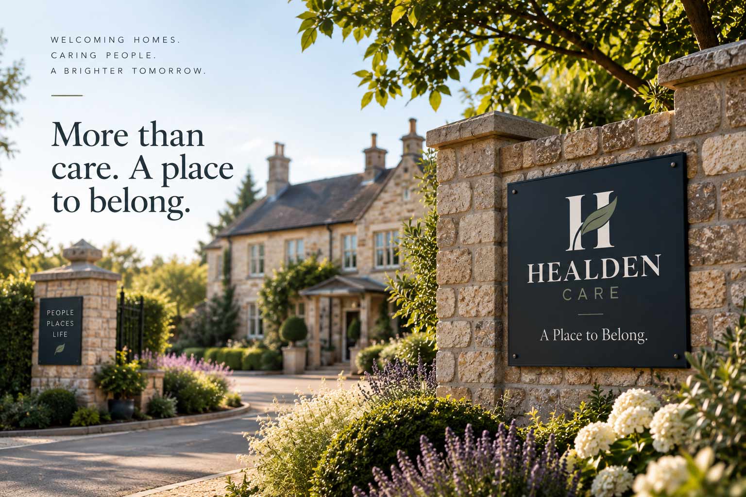
For Healden Care, the physical environment is part of the brand experience. The identity therefore needs to feel natural against stone, timber, gardens, residential interiors and the materials people associate with home—not simply against a white corporate background.
Signage becomes less about announcing an institution and more about creating a recognizable sense of arrival. The restrained palette and simplified mark allow the identity to sit comfortably within that environment rather than competing with it.
Welcoming homes.
Caring people.
A brighter tomorrow.
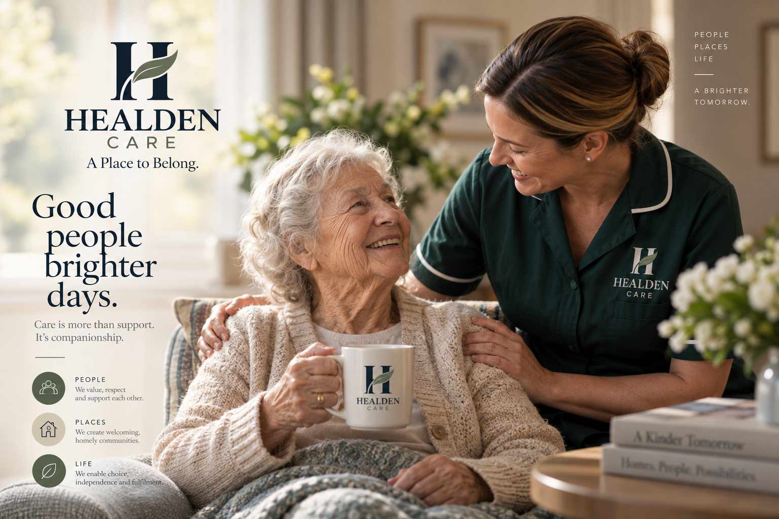
The strongest care brands aren’t really about care facilities. They’re about people continuing to live meaningful everyday lives.
That principle shaped the broader Healden visual language: natural light, familiar surroundings, candid human interaction and imagery centered on everyday moments rather than staged healthcare scenarios.
Good people. Brighter days.
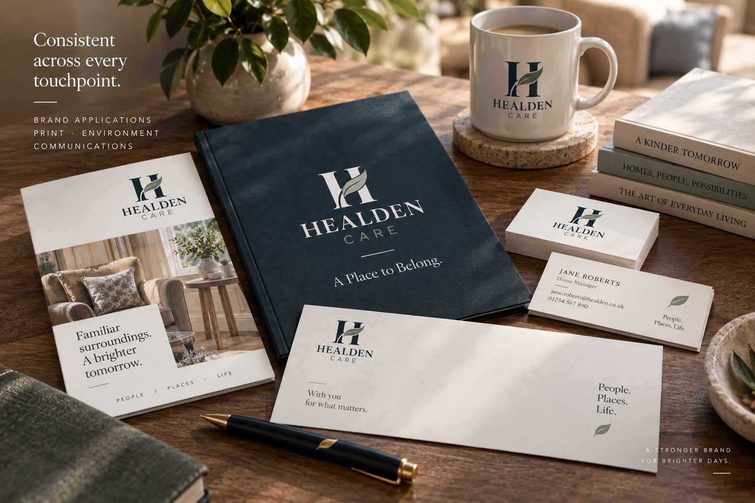
A care brand appears in hundreds of small interactions long before it becomes a large advertising campaign. A brochure handed to a family. A letter. A folder. Information left on a table during a visit.
The visual system was designed to make those interactions feel connected—using the same typography, color, imagery and restrained graphic language throughout. No single item needs to work especially hard. Together, they create familiarity.
Recognition is built one interaction at a time.
Collateral shown uses fictionalized names and contact information for case-study privacy.
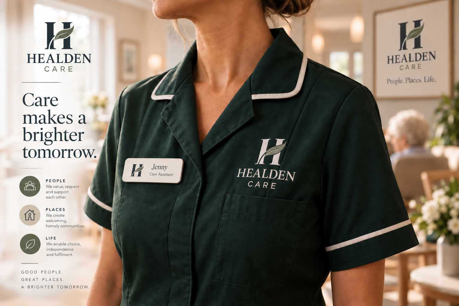
Some of the most important applications are also the smallest. Uniform embroidery, name badges and one-color reproduction place very different demands on an identity than a presentation deck or website hero.
The separation between the leaf and H allows the symbol to remain recognizable at reduced scale, while the monogram can operate independently when the complete wordmark isn’t practical.
Designed for the screen. Tested against the real world.
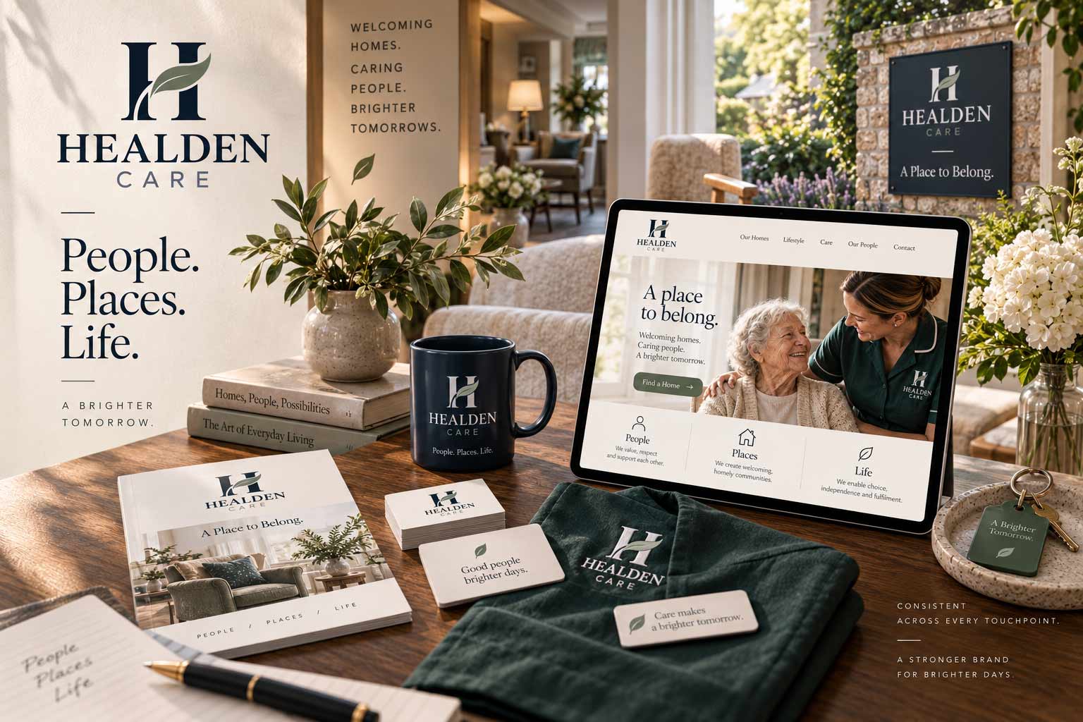
A successful identity creates continuity between experiences that may happen days or months apart. Someone may first encounter Healden online. Later they might receive a brochure, visit a home, meet a member of staff or see the identity on signage.
The Healden system brings those moments together through a consistent combination of mark, color, typography, photography and language—allowing the brand to remain recognizable without becoming repetitive.
People. Places. Life.
A stronger brand for brighter days.
Visual identity in care carries responsibilities that go beyond aesthetics. Contrast, legibility and environmental differentiation matter when an audience can include people with reduced vision or dementia.
That means lighter mid-tones can play an important decorative role without becoming body-copy colors, while darker values provide the contrast required for functional communication. The objective isn’t simply a more attractive brand. It’s a system that understands where—and for whom—it has to work.
Healden Care wasn’t a blank-sheet branding exercise. A substantial strategic foundation already existed. The task was to evaluate that work critically, identify the elements worth preserving and strengthen the parts that weren’t translating into a durable identity.
The final direction retained valuable thinking around accessibility, messaging, photography and the People / Places / Life framework while rebuilding the logo execution and shifting the primary visual language toward a warmer olive-and-neutral palette.
Brand development isn’t always about starting over. Sometimes it’s about seeing more clearly what should survive.
The Healden Care identity developed through collaboration. An outside agency had established the initial strategic framework and brand guidelines. Separately, company leadership explored an alternative H-and-leaf concept that offered a stronger visual direction.
The work here involved evaluating those directions, recommending what should be retained and changed, and refining the selected concept into a cleaner, production-ready vector identity and broader visual direction.
For this case study, the identity has been extended through contemporary visualizations showing how the system can operate across signage, collateral, uniforms, digital experiences and the care-home environment.
The most effective care identities don’t need to constantly remind people that they’re looking at a care organization. They can communicate something more fundamental: warmth, familiarity, trust, life.
Healden Care turns those qualities into a visual system designed to feel as considered in the smallest detail as it does across the larger brand.
AgencyFix helps organizations build new identities and strengthen existing ones—bringing strategy, design and real-world execution together into brand systems built to last.
She isn't a chatbot in the corner. Jessica is the same AI we build for clients — she can answer questions about this project or how a branding engagement works.