AI-powered marketing, lead response & automation for growth-focused teams. Jessica is online · answers in ~7s📞 (661) 219-7549

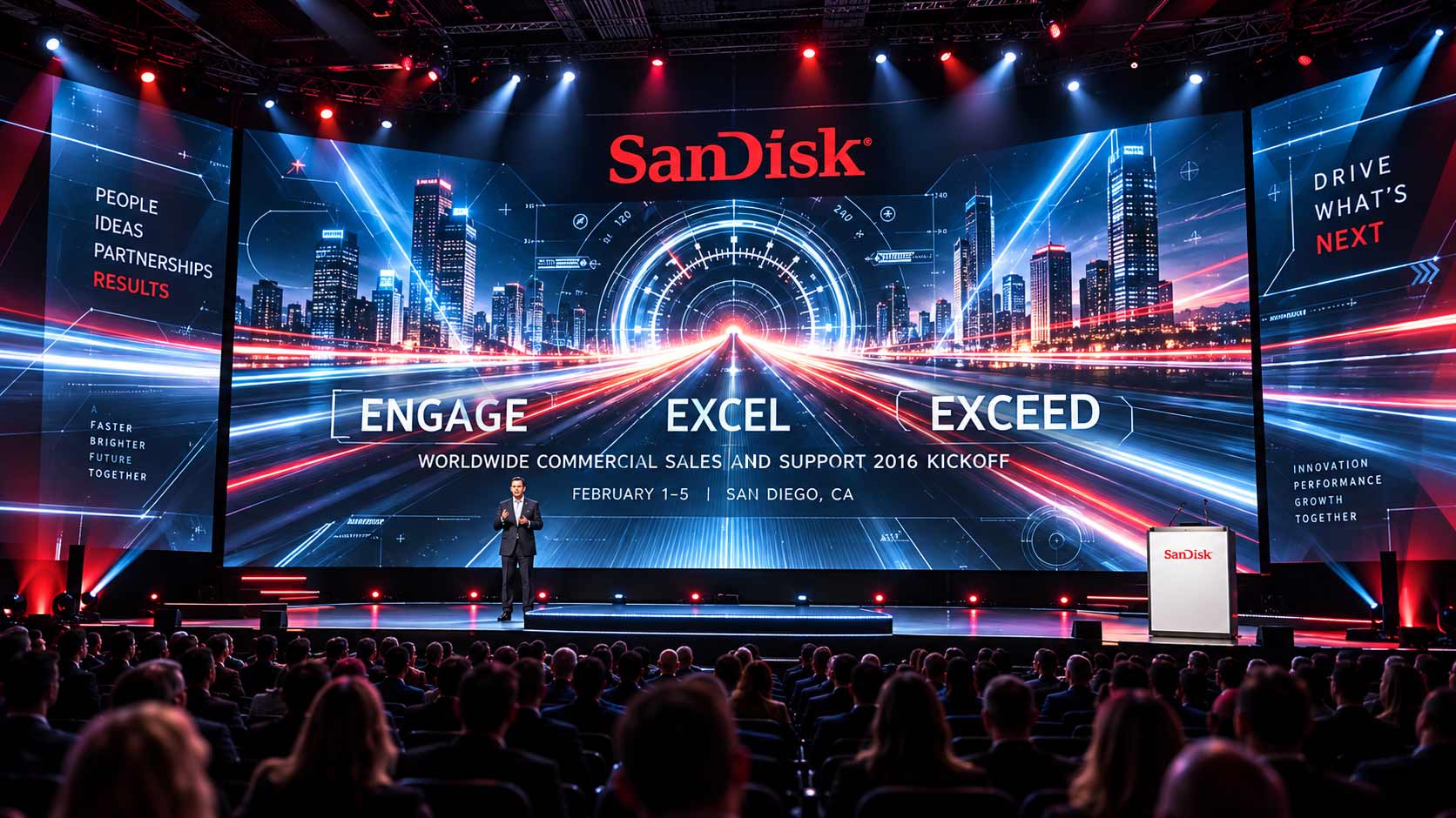
Worldwide Commercial Sales & Support Kickoff
Developed for SanDisk’s Worldwide Commercial Sales & Support Kickoff, the creative direction explored how technology, performance and forward momentum could become a complete event identity.
The challenge was bigger than designing a single graphic. The visual language needed enough energy to command a keynote stage—and enough flexibility to carry through signage, collateral, presentations and the broader conference experience.
A global technology conference needed an identity capable of bringing people together around a shared sense of momentum. The brief called for something modern, technology-driven and forward-looking—but the opportunity was to push beyond the visual conventions of traditional corporate events.
Agency Fix explored multiple creative territories, asking the same question from different angles: what should progress look like? Speed. Partnership. Precision. Engineering. Each answer created a fundamentally different visual system.
Speed. Technology. Performance.
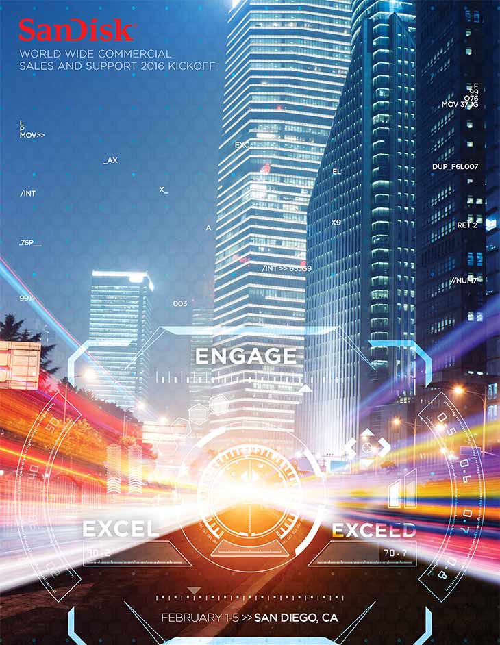
The most ambitious direction imagined the conference through the visual language of speed and advanced technology. A nighttime city becomes a digital cockpit. Data, targeting graphics, illuminated pathways and interface elements transform the environment into something between a performance machine and a glimpse of the future.
Rather than simply talking about acceleration, the identity was designed to feel fast.
The same visual vocabulary can expand far beyond a single graphic. At event scale, the cockpit-inspired interface becomes an immersive environment—extending across keynote screens, stage architecture and digital surfaces while retaining the speed and intensity of the original concept.
The identity doesn’t simply decorate the environment. It becomes the environment.
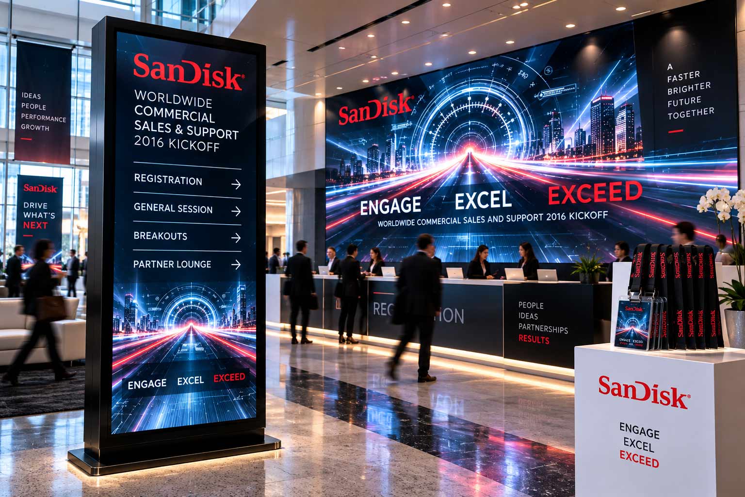
A strong event identity has to survive outside the hero moment. Registration. Wayfinding. Digital displays. Credentials. Directional signage.
The futuristic system was conceived as a flexible visual language capable of guiding attendees through the experience while maintaining the energy established by the main-stage creative.
A conference identity shouldn’t stop at the stage.
Strong creative exploration isn’t about changing a color or moving a headline. Agency Fix approached the brief through distinctly different visual territories—each built around its own idea, composition and design language.
The result was a collection of concepts ranging from immersive futurism to typography, graphic minimalism and architectural precision.
Typography as identity.
Where the futuristic direction relied on immersion and speed, this concept made typography the architecture. Oversized letterforms, layered language, transparent geometry and a restrained blue-and-red palette create a system that feels sophisticated, dimensional and unmistakably technology-driven.
The hierarchy itself becomes the visual.
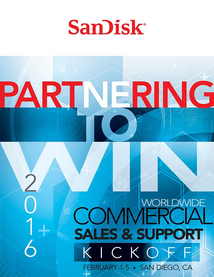
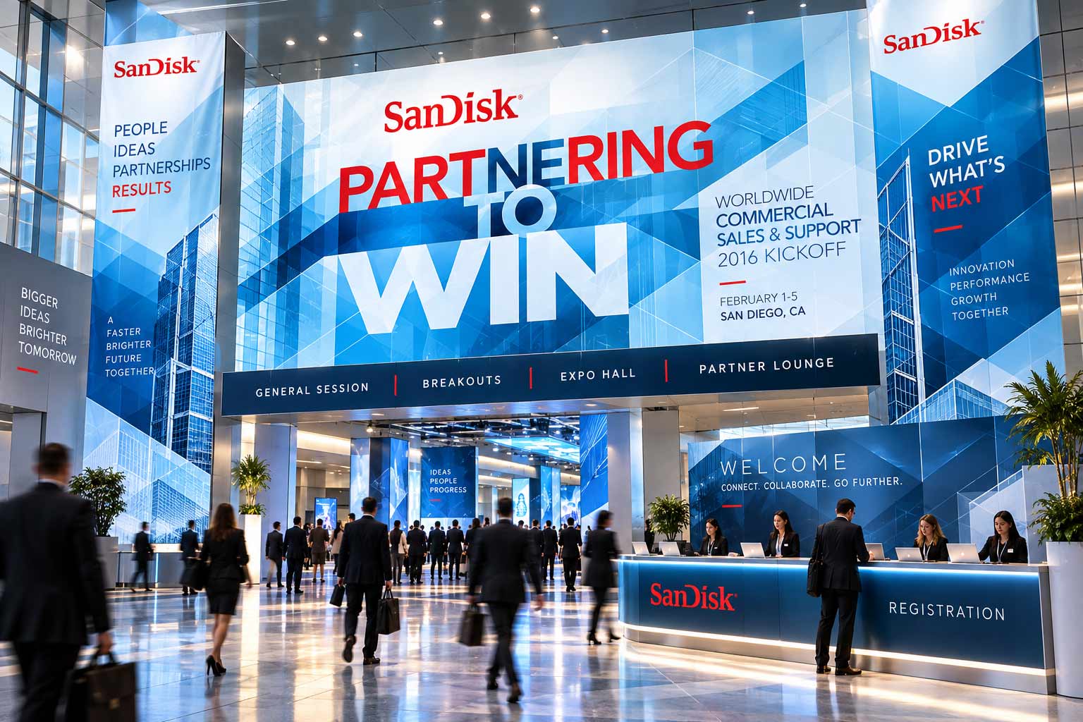
Scaled into the physical environment, the typography becomes more than messaging. It becomes signage. Structure. Navigation. A recognizable visual landmark capable of carrying the identity throughout a large conference environment.
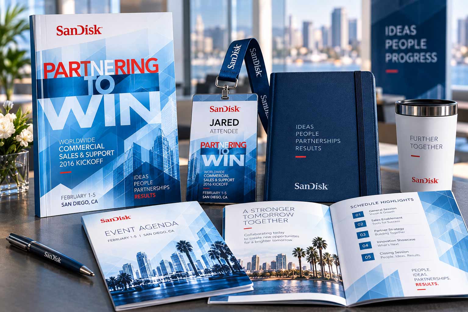
The same visual language was extended across the pieces attendees would encounter throughout the conference—from programs and agendas to credentials and supporting materials.
The challenge at this scale is different. The identity still needs personality, but information has to remain immediate and usable.
Stage → Signage → Program → Credential → Experience
Maximum impact. Minimum complexity.
Not every technology identity needs to look complicated. This direction strips the visual language down to a few powerful ingredients: red, black, white, type, mechanical forms.
The interlocking gears turn three ideas—engagement, excellence and exceeding expectations—into one immediate graphic system.
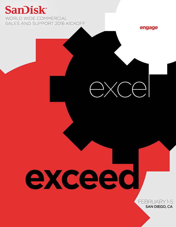
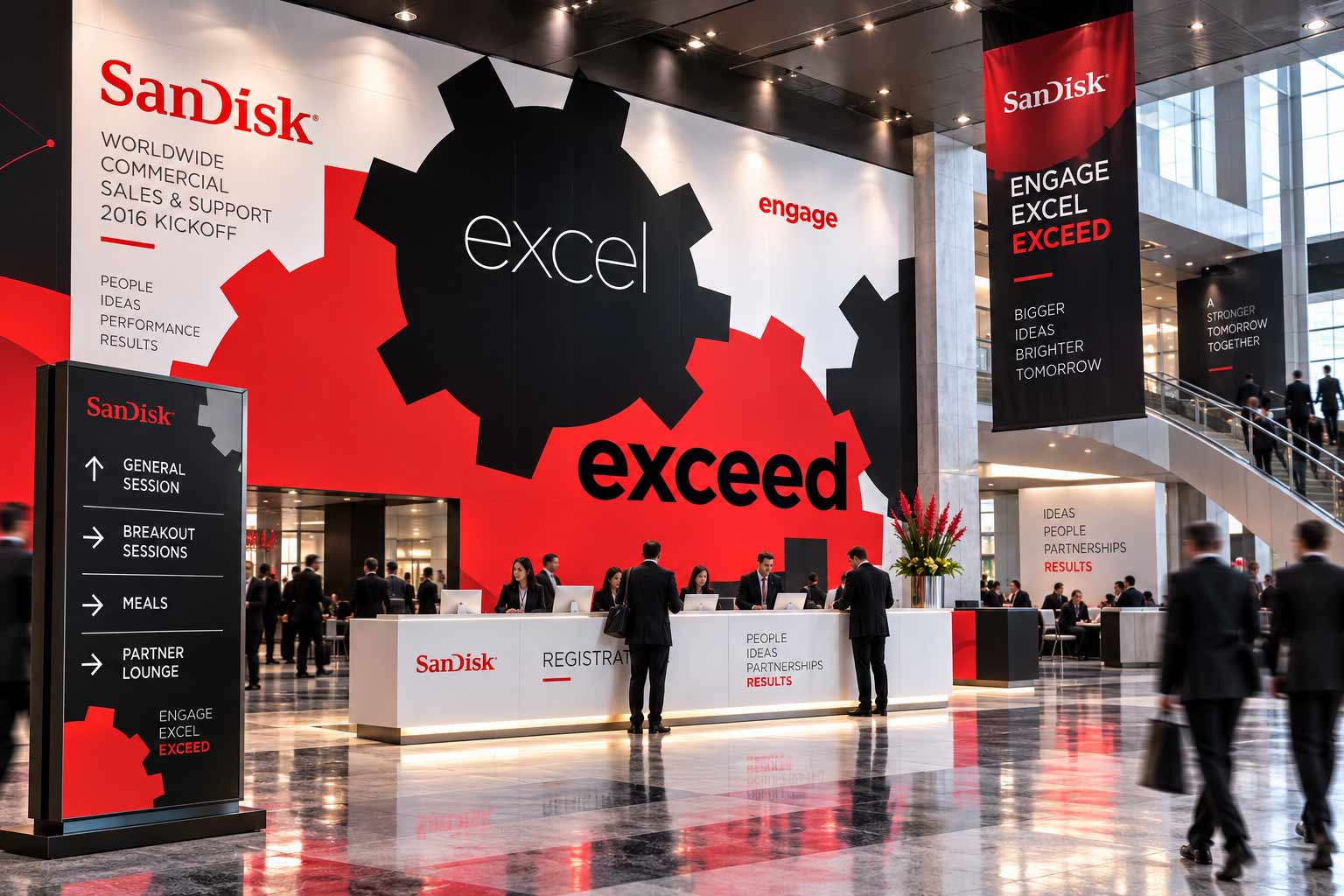
What begins as a deliberately restrained graphic becomes architectural when enlarged. Oversized gear forms and typography can transform registration areas, walls, signage and transitional spaces without requiring a complicated visual system.
This is the opposite of the futuristic direction. And that’s the point.
Progress, drawn before it’s built.
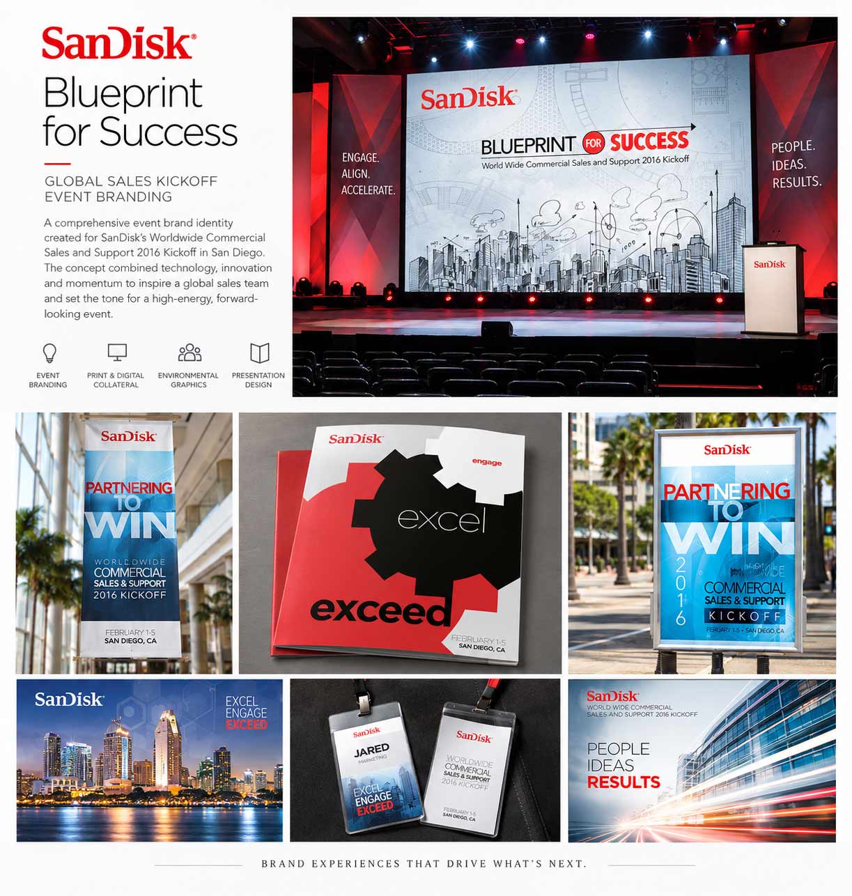
The blueprint direction approached the theme conceptually. If the conference is about building future success, what if the identity shows that future being planned? Architectural drawings, measurements, annotations, sketches and structural lines turn strategy into something tangible.
The visual language suggests that progress isn’t accidental. It is designed.
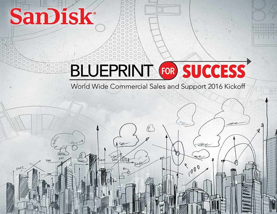
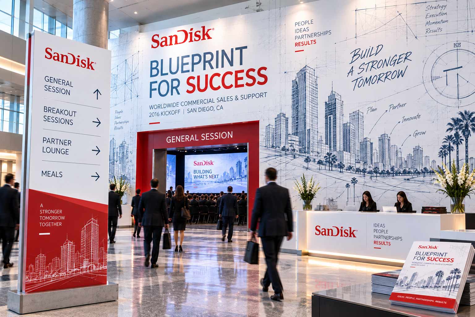
Extended into the conference environment, the blueprint language becomes a natural wayfinding and communication system. Technical drawings can travel across walls, directional graphics, programs and signage while maintaining a clear connection to the central idea.
Each direction began with the same brief. None relied on simply reskinning the previous idea. Instead, each explored a different answer to the same strategic question—demonstrating how concept, typography, imagery and environment can completely change the way an audience experiences a brand.
Future Forward
Immersive · Fast · Technological
Partnering to Win
Typographic · Dimensional · Collaborative
Engage · Excel · Exceed
Graphic · Bold · Immediate
Blueprint for Success
Conceptual · Technical · Structured
The strongest event identities operate at multiple scales. They have to stop someone from across a convention hall. Guide someone toward the next session. Organize information on an agenda. Create energy behind a keynote speaker. Remain recognizable on a badge small enough to hold in your hand.
That is why the work was approached as a system rather than a single piece of artwork.
Event branding lives at the intersection of identity and experience. For SanDisk, the creative exploration pushed a single conference brief through radically different visual territories—demonstrating how one strategic idea can become technology, typography, architecture and environment.
AgencyFix creates visual identities and creative systems designed to work everywhere—from the smallest piece of collateral to the biggest room in the building.
She isn't a chatbot in the corner. Jessica is the same AI we build for clients — she can answer questions about this project or how a creative engagement works.