AI-powered marketing, lead response & automation for growth-focused teams. Jessica is online · answers in ~7s📞 (661) 219-7549

A playful cocktail brand built to make “skinny” feel anything but boring.
My Skinny Señorita needed to stand apart in a category where low-calorie products could easily feel clinical, restrictive or forgettable. The identity took the opposite approach—bold personality, fashion-inspired illustration, confident typography and an unmistakable visual presence designed to make the better-for-you proposition feel fun.
The result was a consumer identity built to work from the bottle outward: logo, character, packaging, flavor differentiation and supporting brand collateral designed as one recognizable system.
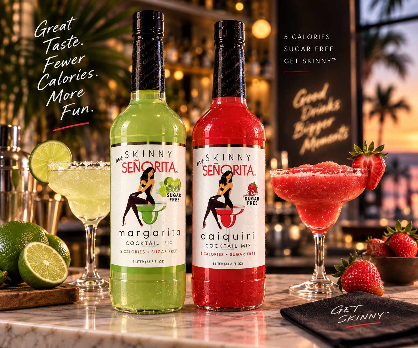
The central challenge was simple: how do you communicate a low-calorie, sugar-free proposition without making the product feel like a compromise? The answer was to build the brand around personality rather than restriction.
The illustrated Señorita became the visual centerpiece—a confident, glamorous character perched inside an oversized cocktail glass. Paired with an expressive red, black and white palette and the recurring “Get Skinny” message, the identity gave the product a playful attitude that could be recognized before a customer ever read the label.
The benefit was “skinny.” The brand never had to feel that way.
The system relies on a deliberately tight set of visual ingredients: an illustrated brand character, distinctive typography, a high-contrast red-black-white palette and flavor-specific accents. Together they create enough consistency for immediate recognition while leaving room for individual products and messages to change.
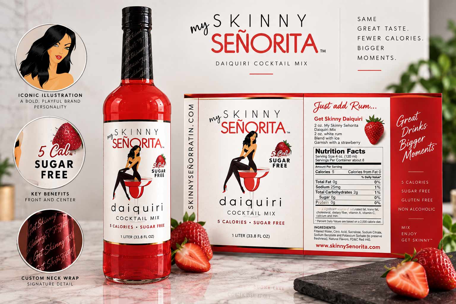
The bottle became the brand’s most important canvas. The packaging system brought together the Señorita character, product name, flavor, nutritional proposition and preparation instructions without losing the personality of the identity. The front label creates immediate shelf recognition while the surrounding packaging provides the information needed to turn interest into purchase.
Margarita and Daiquiri were differentiated through flavor-specific color and fruit cues while maintaining a consistent master-brand structure.
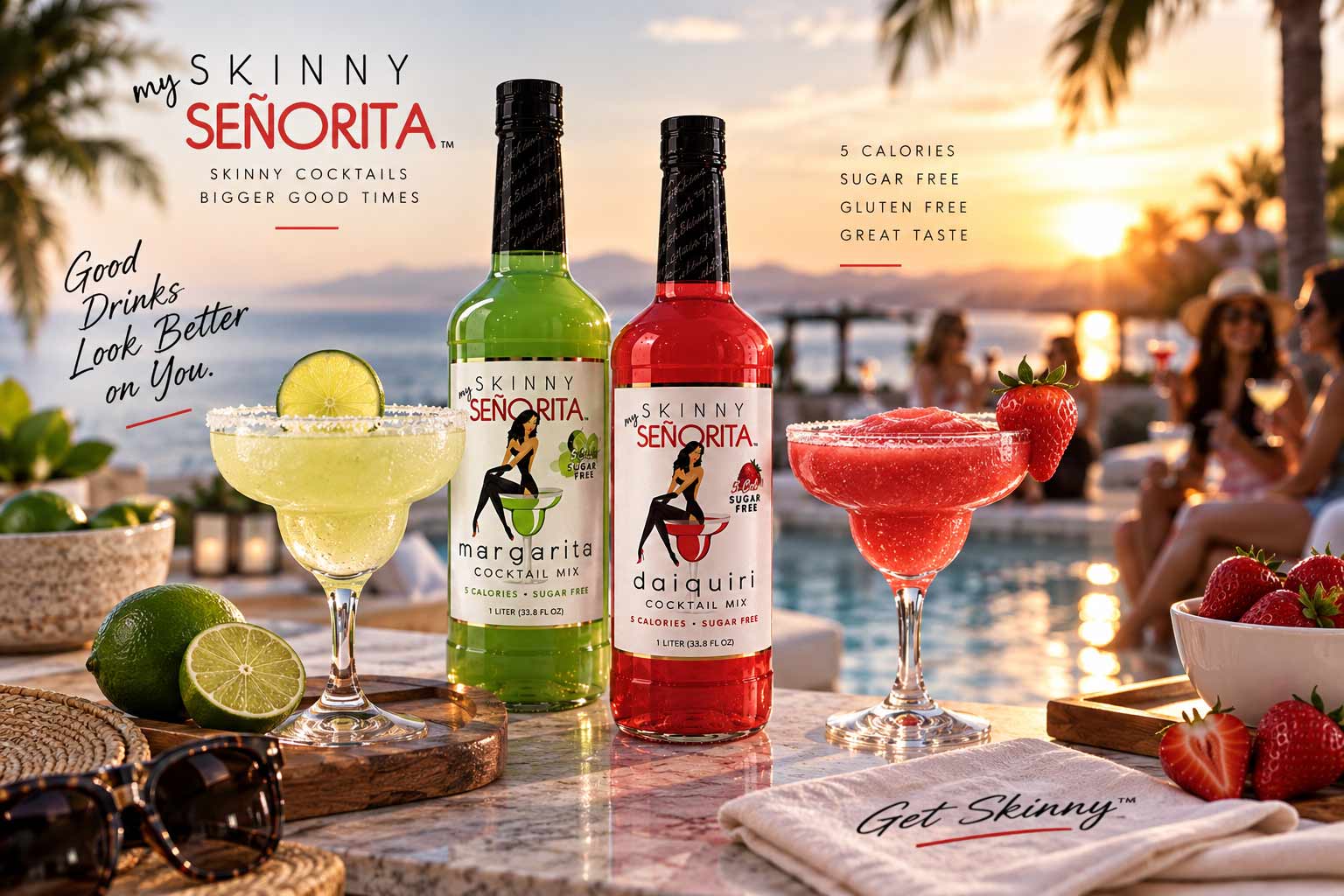
A consumer brand has to communicate more than what is inside the bottle. It has to show where the product belongs. Extending the identity into lifestyle imagery shifts the conversation from calories and ingredients to the experience surrounding the drink—social occasions, warm weather, entertaining and the ritual of making a cocktail.
The product benefit remains present, but it becomes part of a larger promise: lighter cocktails without giving up the occasion.
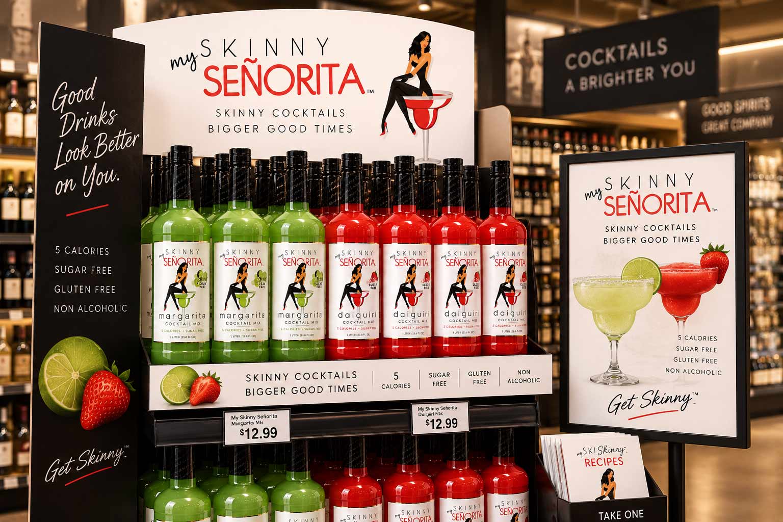
Packaging rarely appears in isolation. At retail, the identity has seconds to attract attention among competing products. The Skinny Señorita system scales naturally into point-of-sale materials, shelf communication and product displays by repeating its strongest assets: the character, the red-and-black palette, flavor colors and concise product benefits.
See it. Know it. Get Skinny.
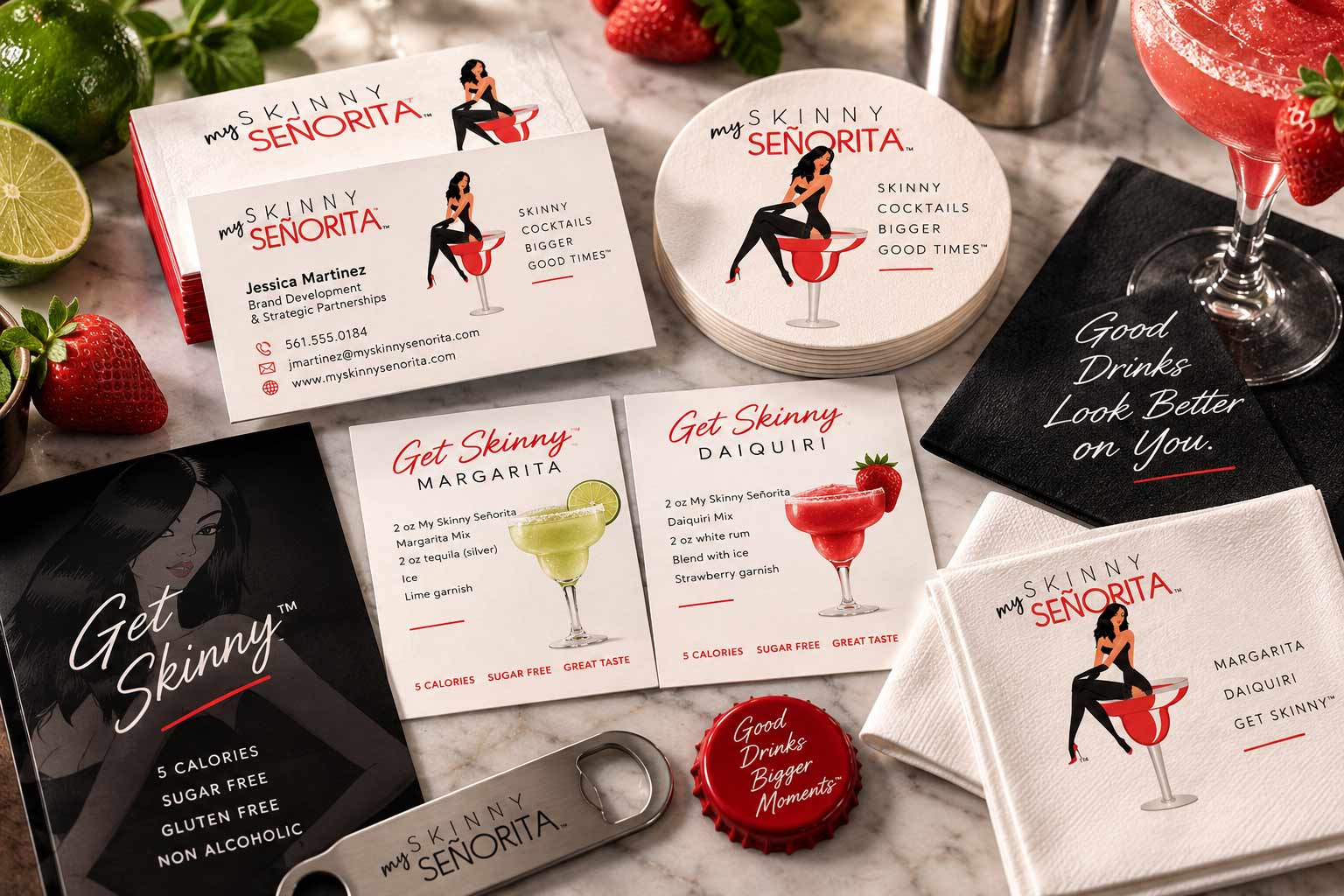
The identity was designed to move beyond the bottle. Business collateral, recipe cards and supporting materials extend the same visual language into sales, promotion and customer interaction. Repeating the character, typography and messaging creates continuity without requiring every application to look identical.
The result is a flexible identity with enough personality to remain recognizable whether it appears on a bottle label, business card, recipe card or cocktail coaster.
Collateral shown uses fictionalized contact information for case-study privacy.
A strong consumer identity should have enough visual equity to become an environment. The same system developed for packaging can extend into events, sampling, hospitality and branded activations without requiring a new creative language. Signage, menus, uniforms, product displays and environmental graphics all draw from the same recognizable identity.
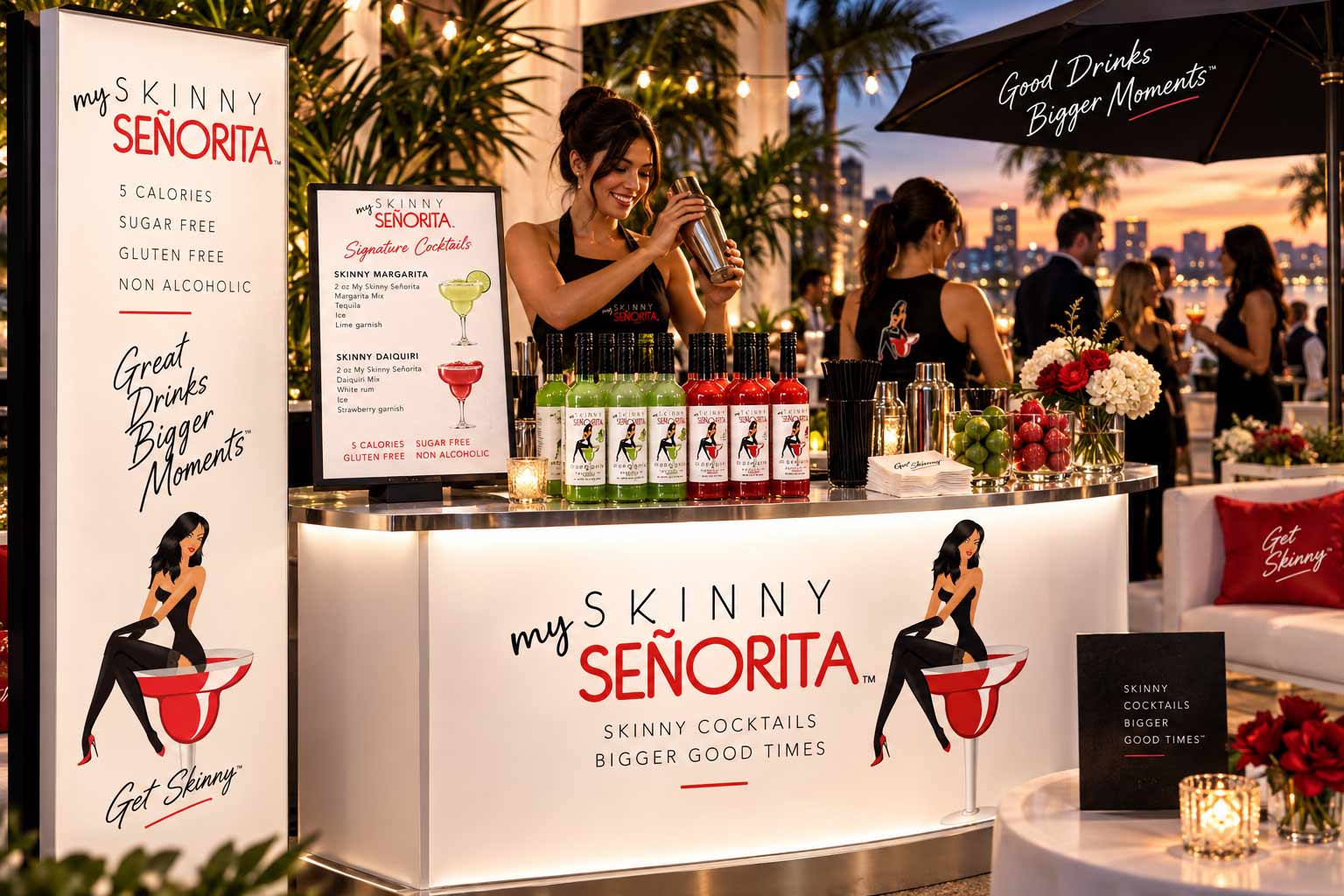
One identity. Every point of contact.
The original My Skinny Señorita project included brand identity development, custom illustration, bottle-label and packaging design, product differentiation and supporting business collateral.
For this case study, the original work has been re-presented and extended into contemporary lifestyle, retail and experiential applications to demonstrate how the identity can scale across a broader consumer brand ecosystem. The original identity and packaging remain at the center of the project; the expanded applications show how that foundation can continue across modern brand touchpoints.
AgencyFix develops identity systems that go beyond the logo—from positioning and visual language to packaging, digital experiences and the places customers encounter your brand.
She isn't a chatbot in the corner. Jessica is the same AI we build for clients — she can answer questions about this project or how a branding engagement works.