AI-powered marketing, lead response & automation for growth-focused teams. Jessica is online · answers in ~7s📞 (661) 219-7549

A new mission. A clear path forward.
Veterans leave military service with experience built around leadership, discipline, responsibility and execution. The challenge is translating those strengths into what comes next.
Veterans Pathway to Business Success needed an identity capable of connecting those two worlds—honoring military service while looking decisively toward entrepreneurship, opportunity and the future.
The resulting identity is built around one simple idea: the path forward.
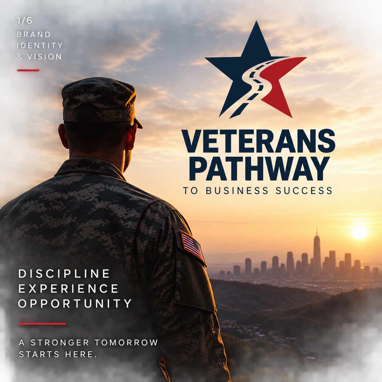
The identity begins with one of the most recognizable symbols of American service: the star. But the star isn’t the destination.
A road cuts through its center, moving upward and forward. That pathway becomes the defining element of the identity—a visual representation of transition from one chapter into another.
Military experience doesn’t disappear when service ends. It becomes part of the road ahead.
Service is part of the story. The path forward is the next chapter.
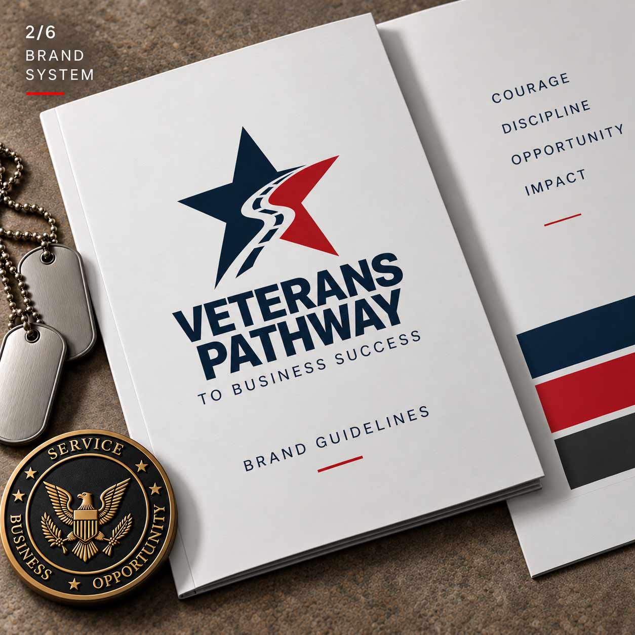
The palette intentionally begins with familiar American colors, but the execution is restrained.
Deep navy provides authority and stability. Red creates energy and forward momentum. Warm white keeps the system open and contemporary. Rather than relying on decorative patriotic imagery, the identity uses color, typography and the pathway symbol to create recognition.
Patriotic without becoming predictable.
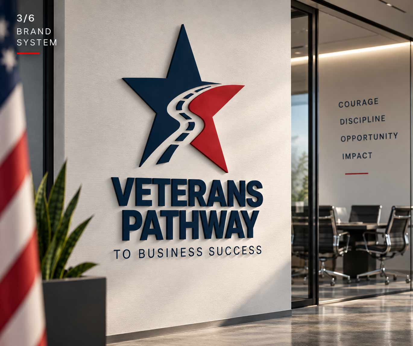
A brand becomes more credible when it can move confidently beyond the page. Applied to physical environments, the Veterans Pathway identity becomes part of the experience itself—creating a visual connection between the organization’s mission and the spaces where veterans, mentors and business leaders might come together.
The symbol remains recognizable at scale while the typography gives the organization a strong institutional presence.
The identity has to do more than create recognition. It also has to help explain what the organization offers.
The visual system extends naturally into program communications, creating a simple framework for presenting the resources available to veterans pursuing their next chapter.
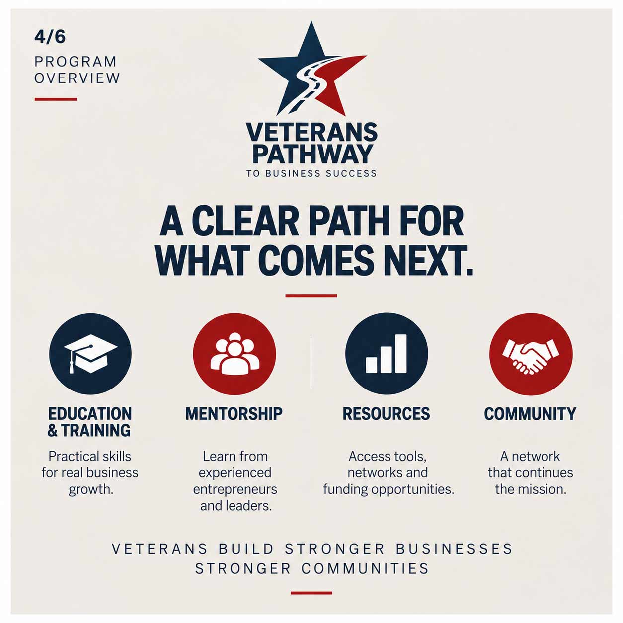
Veterans build stronger businesses. Stronger communities.
These program categories and descriptions are part of the contemporary case-study visualization rather than confirmed historical program offerings.
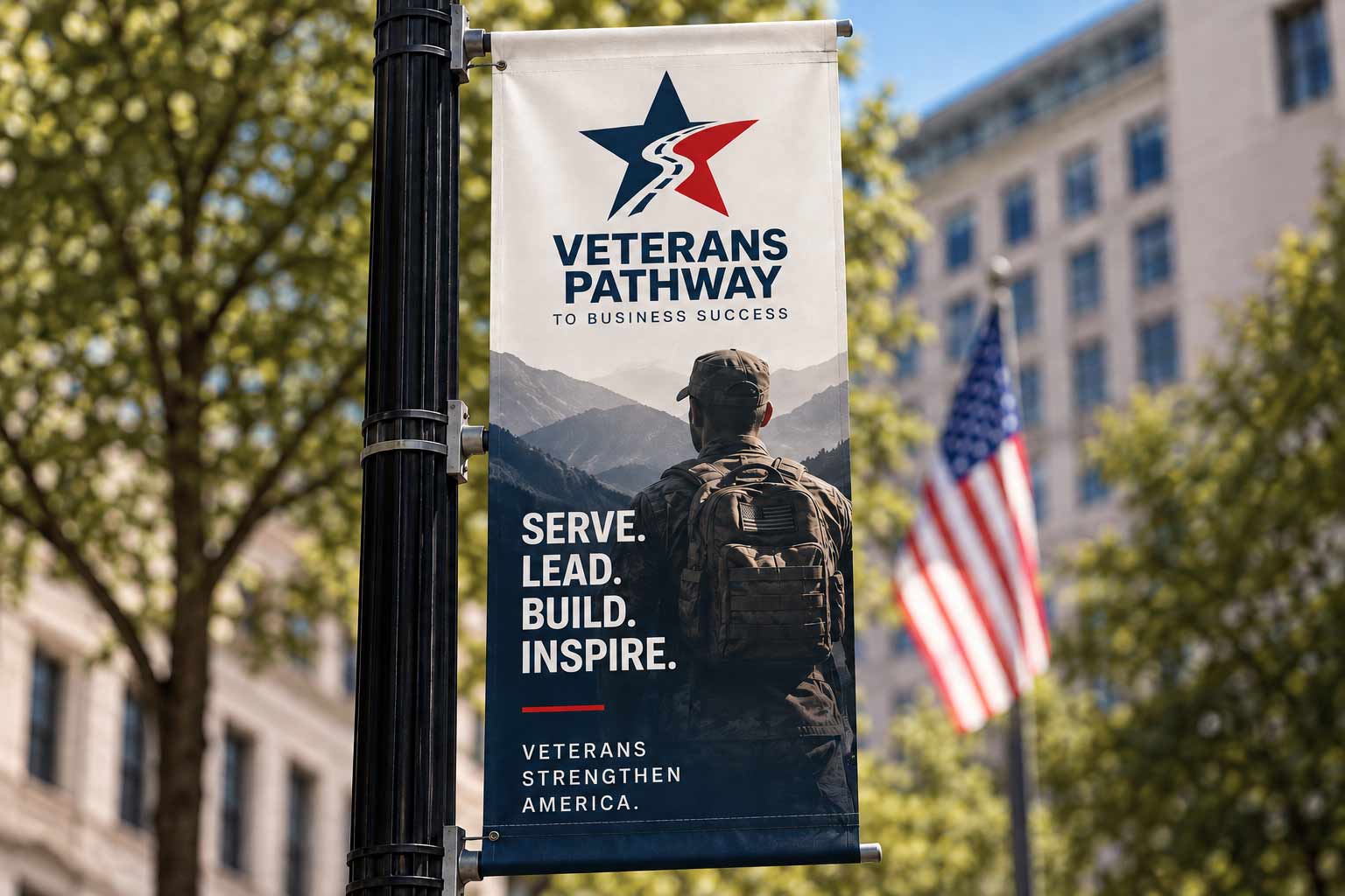
The brand also needs to work outside an office or presentation. In public-facing applications, the visual language becomes more direct.
Strong photography, concise messaging and the recognizable star-and-path symbol turn the identity into an invitation—speaking to veterans not simply about where they’ve been, but about where their experience can take them next.
Veterans strengthen America.
This street-banner installation is a contemporary visualization of how the identity could extend into public-facing campaign media, not documentation of an existing installation.
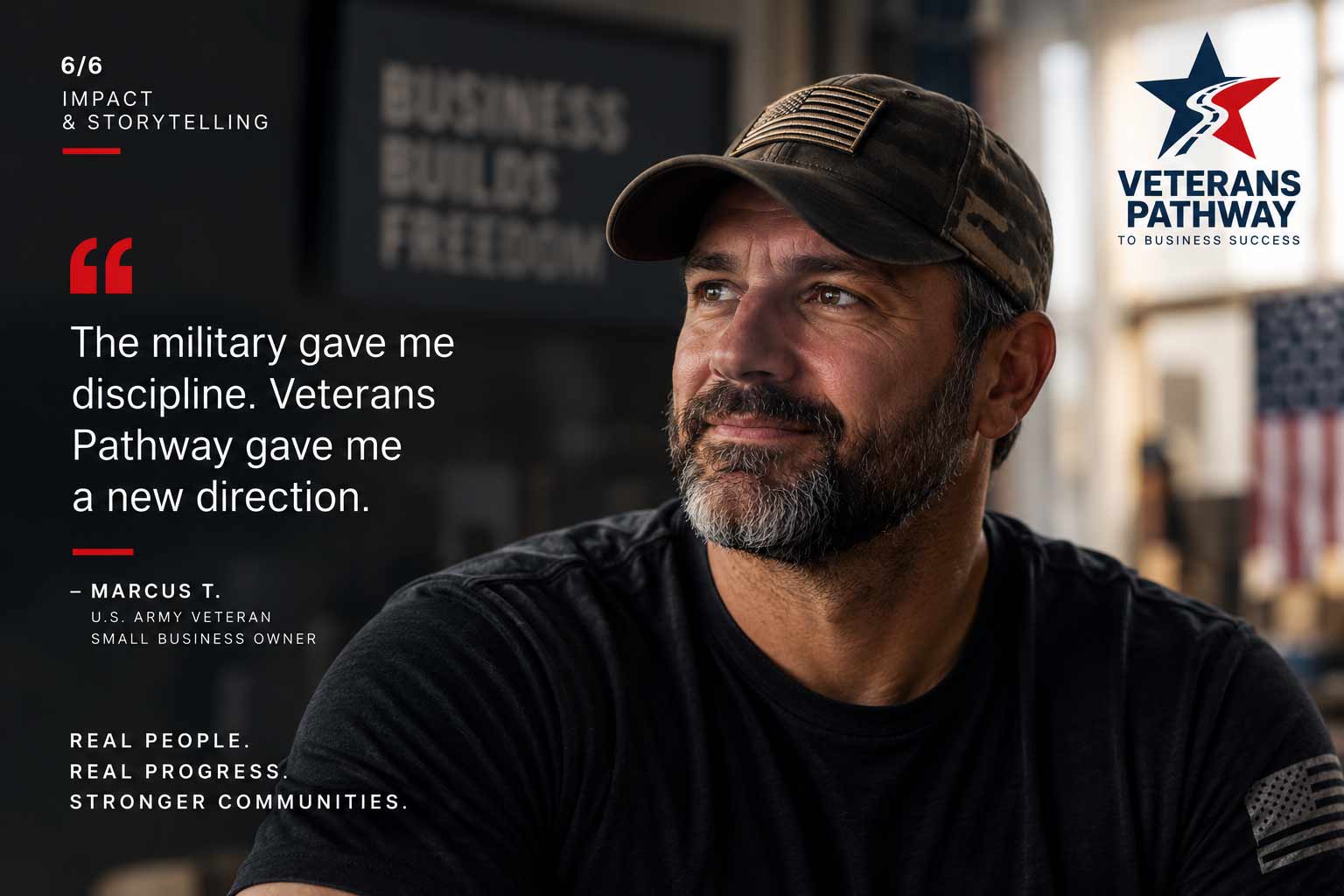
Programs can describe services. Stories communicate possibility. A people-centered campaign layer gives the identity room to move beyond institutional messaging and focus on the veterans themselves—their experience, ambitions and next chapters.
Photography and first-person storytelling can make the brand feel less like a program veterans encounter and more like a community they can see themselves joining.
Conceptual testimonial campaign application — the individual and quote shown are a fictional presentation concept, not a documented participant or testimonial.
Star
Pathway
Wordmark
Color
Typography
Values
Programs
Resources
Information
Signage
Events
Community presence
Veterans
Entrepreneurship
Opportunity
The strength of the identity isn’t any single application. It’s the ability of one central idea—the pathway—to connect the organization’s purpose across very different environments.
From a logo to a program guide, from an office wall to a public campaign, the visual language continues telling the same story: there is a path forward.
The Veterans Pathway to Business Success identity was developed around the relationship between military service and the transition into business and entrepreneurship. The star-and-pathway mark forms the foundation of the visual identity.
For this case study, the identity has been expanded into a contemporary brand system across program communications, environmental branding, public-facing campaign media and storytelling applications to demonstrate how the original concept can operate across a broader organization. These expanded applications are case-study visualizations and should not be interpreted as documentation that every depicted execution was part of the original engagement.
Veteran-focused identities naturally look backward toward service. This identity deliberately does both.
The star acknowledges where someone has been. The road points toward where they’re going. That tension—service and possibility, experience and opportunity, past and future—gives the mark its meaning.
The star establishes who it’s for. The road explains why it exists.
A brand identity built around service, transition and the road ahead.
AgencyFix develops identities and visual systems that turn an organization’s purpose into something people can recognize, understand and carry forward.
She isn't a chatbot in the corner. Jessica is the same AI we build for clients — she can answer questions about this project or how a branding engagement works.